The York Project Dining Room & Entry Reveal
The York Project Dining Room & Entry Reveal
Design
We’re so glad you’re here as we take a tour of our York Project’s dining room and entry. This project was such a joy to work on and we loved making this home beautiful and functional for our clients and their young family.
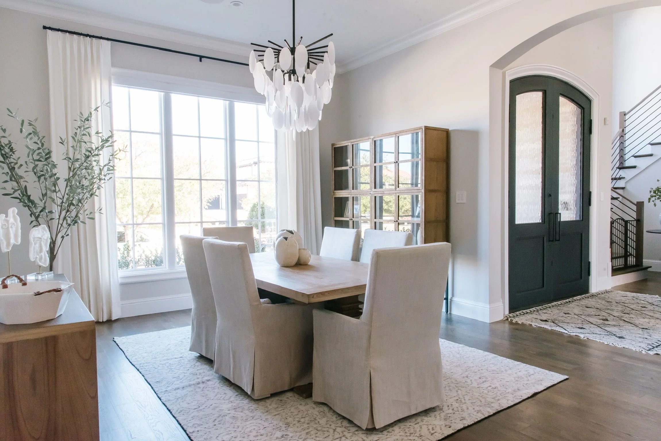
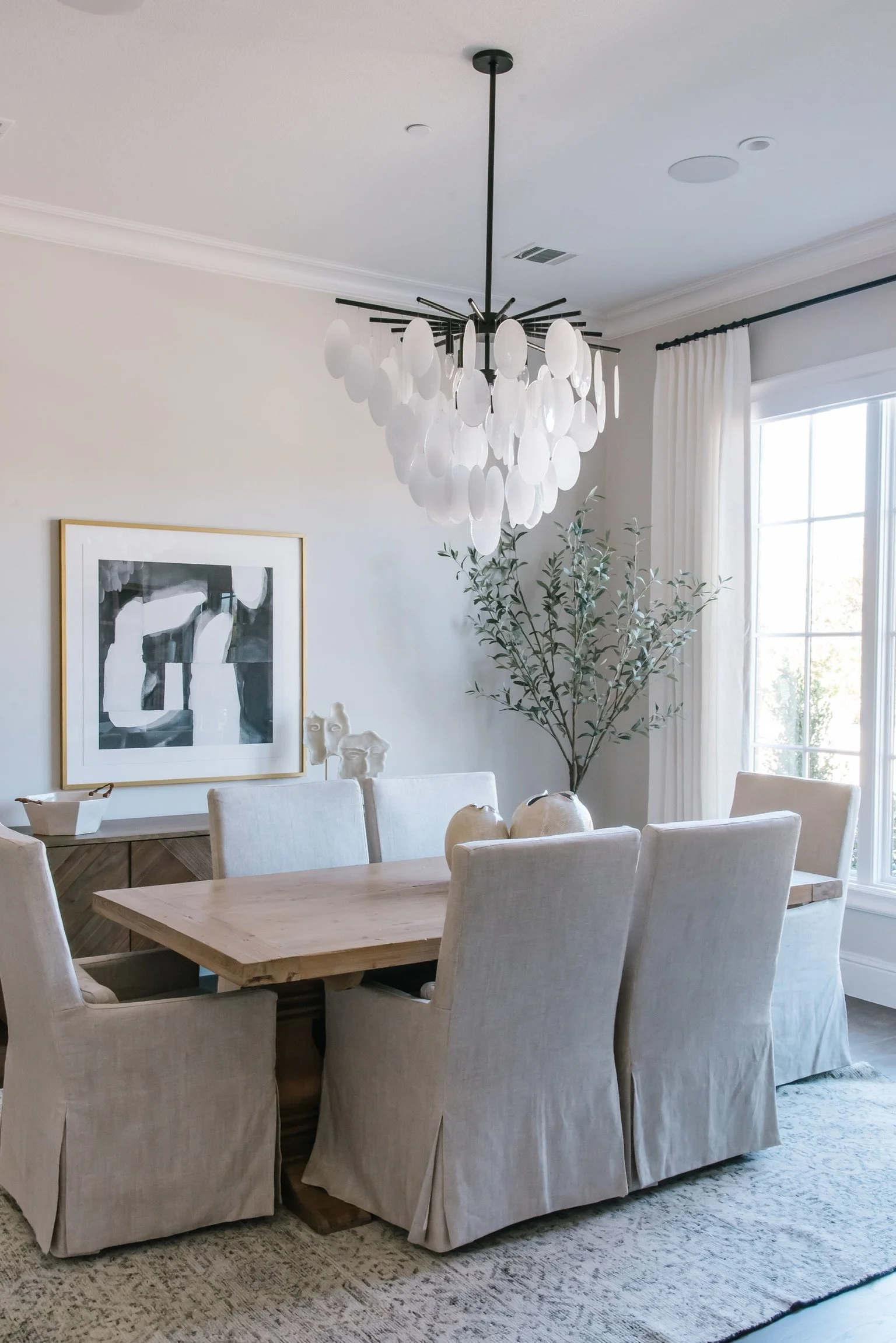
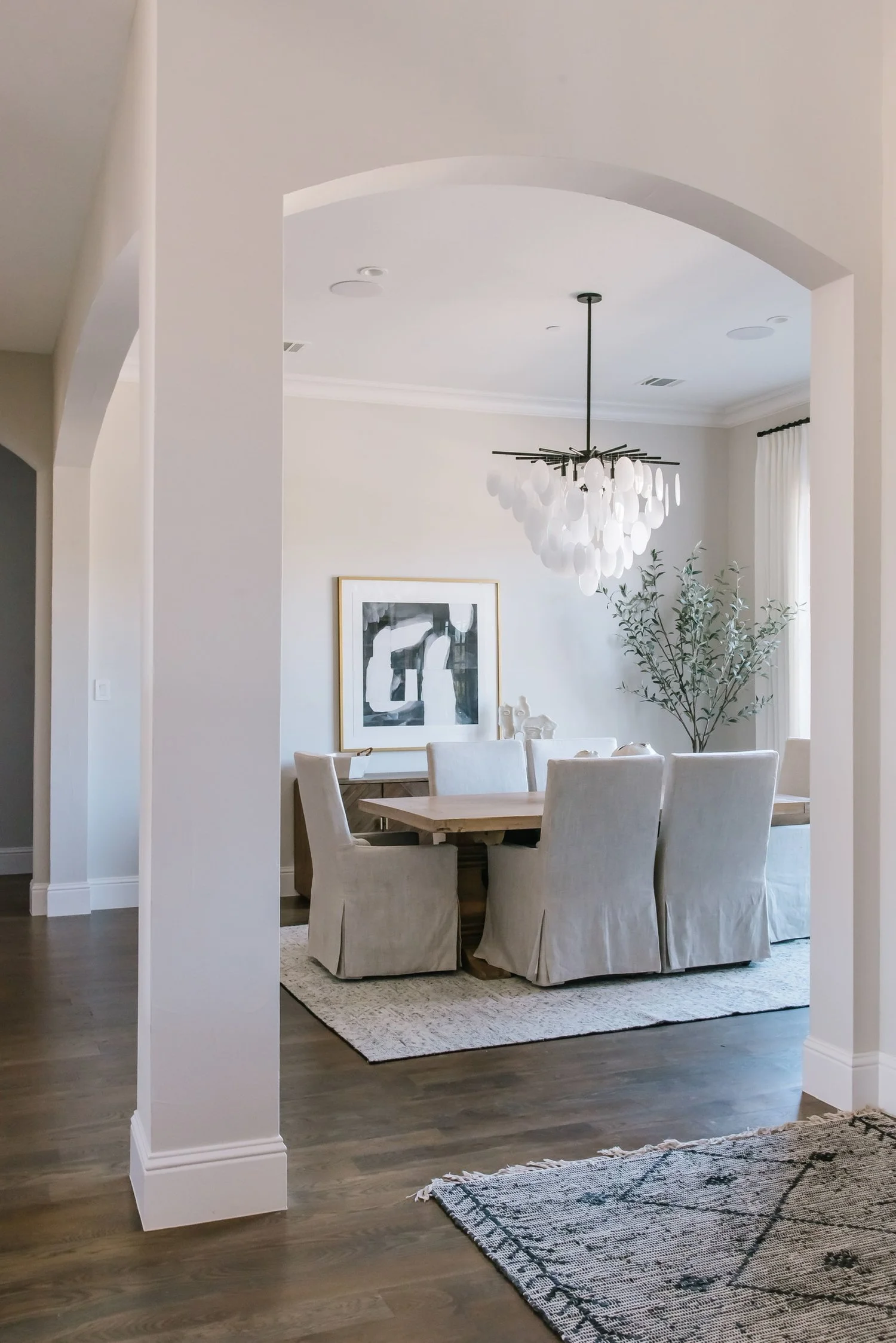
If you’ve been following along with the two previous spaces in this home, the kitchen & dining nook and the great room, you’ll remember that our goal was to create a beautiful home that flowed from space to space, with a neutral palette that pops. Here in the dining room we were able to continue that by bringing together practical pieces that are durable for a growing family, but are also beautiful and timeless.
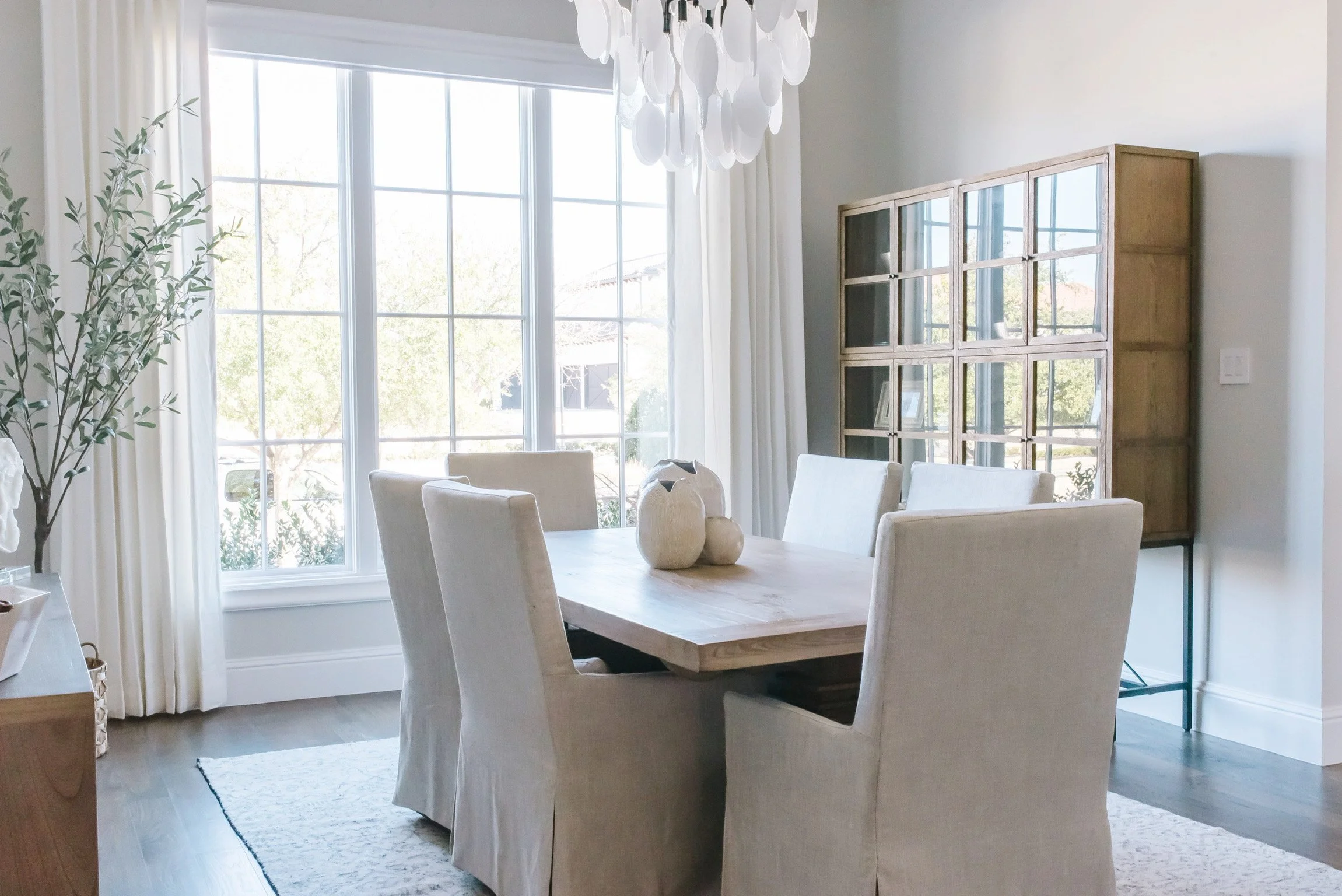
All the furniture pieces are from the House Sprucing furniture line. The dining table is a classic wood farmhouse style table that is incredibly durable for a family with children. The dining room chairs are covered with an amazing performance fabric that can take food and liquid spills with a simple clean-up!
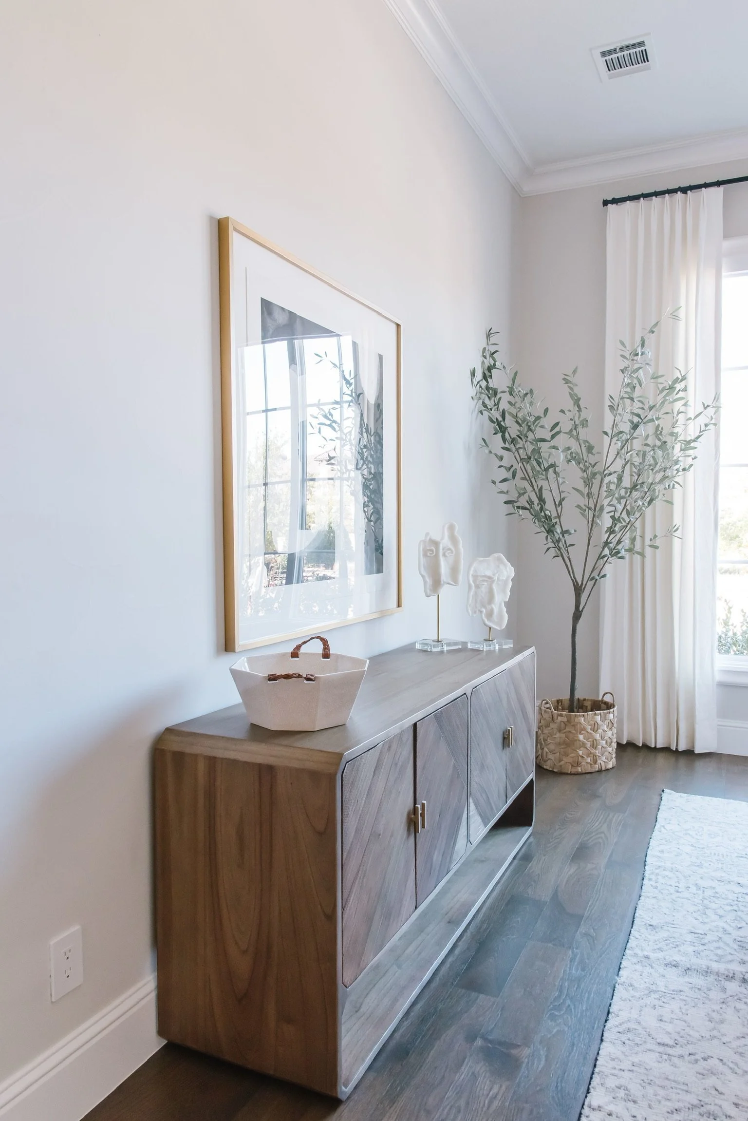
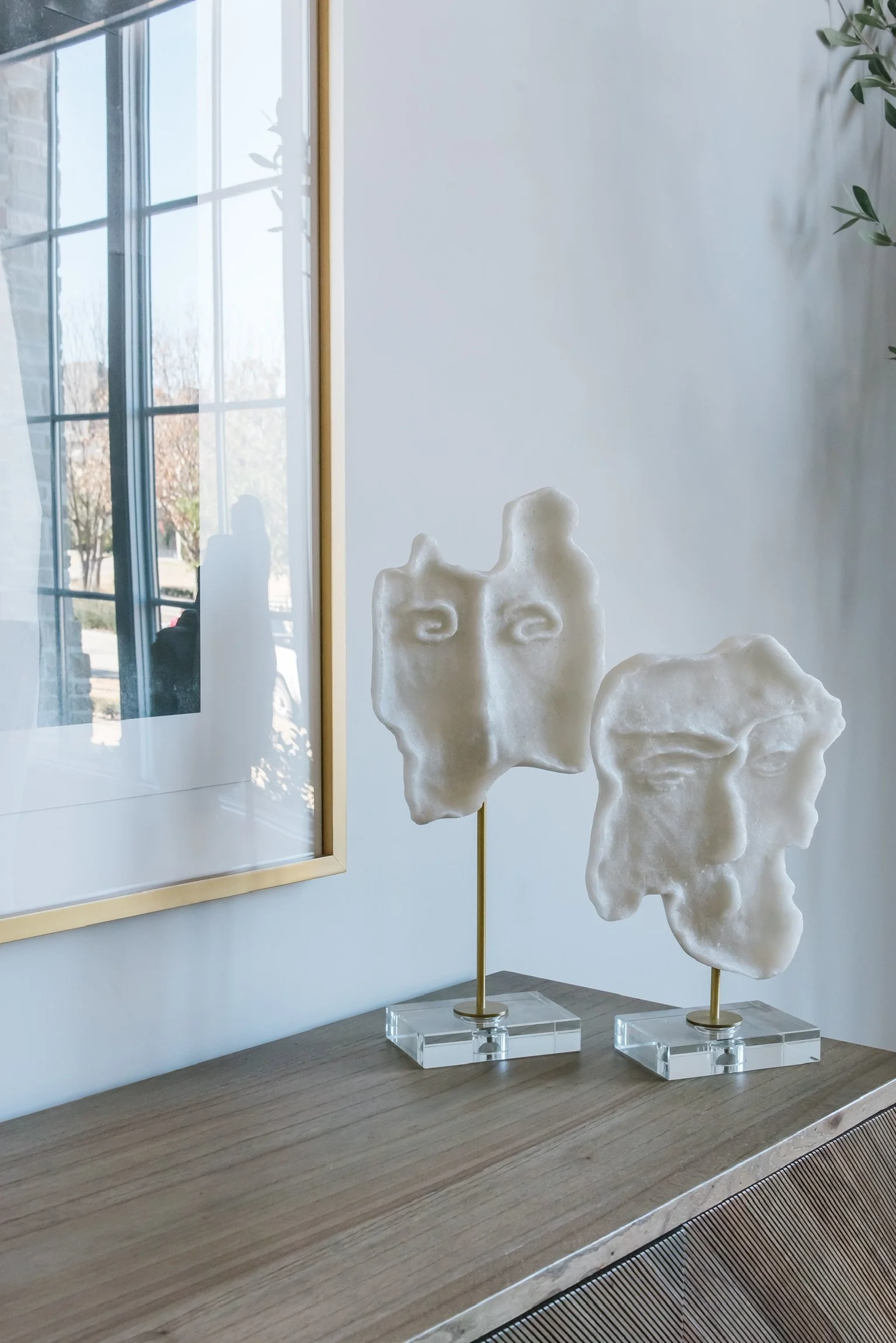
We love the side table for it’s beautiful modern curved lines, it’s practical storage, and for the beautiful details on its doors. The faux tree in the corner brings a touch of nature and life to the space.
The cabinet that sits on the opposite side of the room is also a classic piece for our clients to display their beautiful serving ware and other mementos.
The chandelier adds amazing modern luxury to the space with it’s wispy seedy glass discs and black iron frame. It was the perfect way to give this family a designer look.
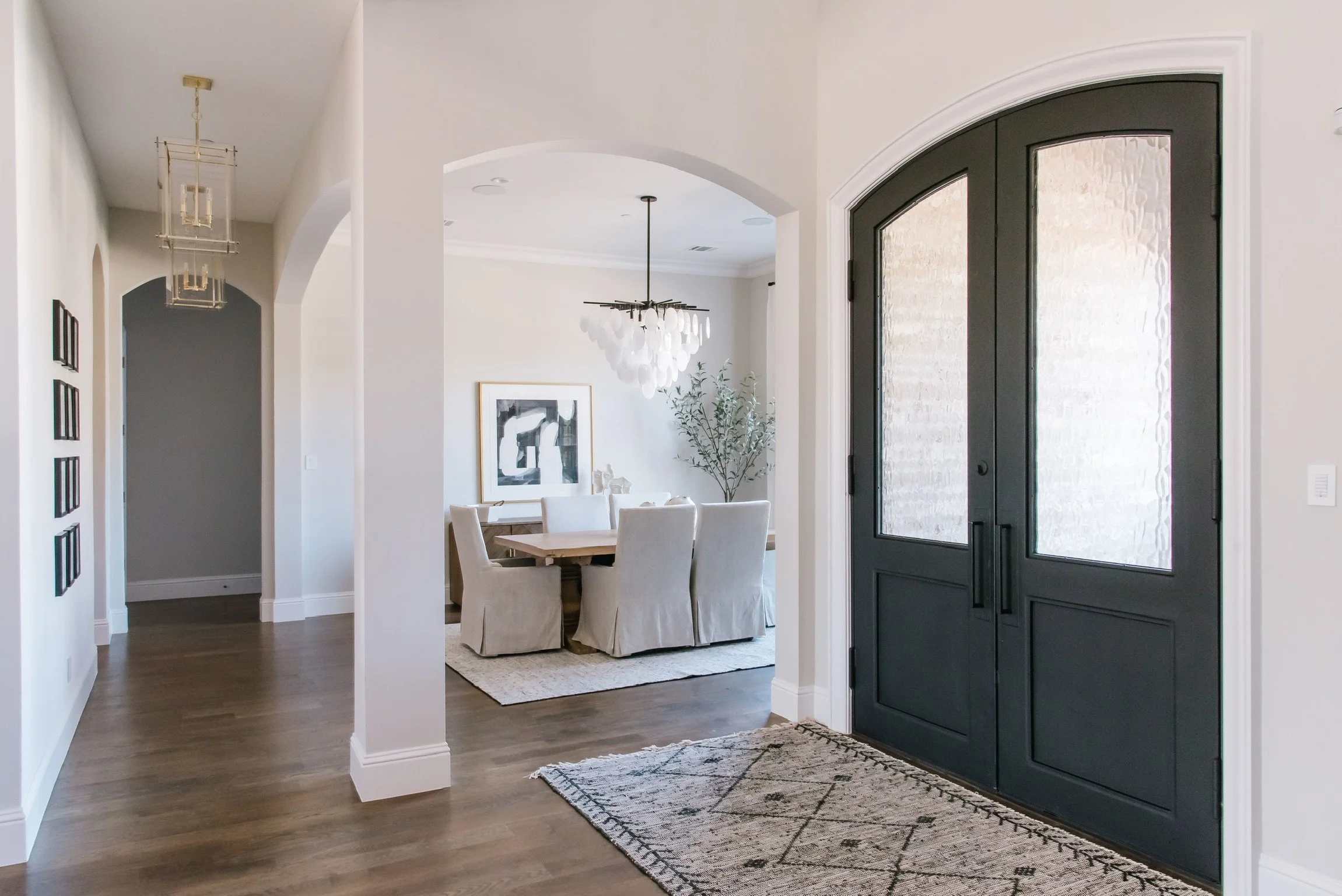
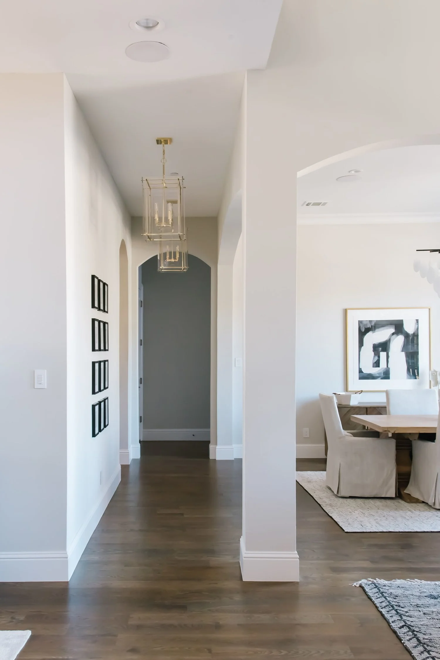
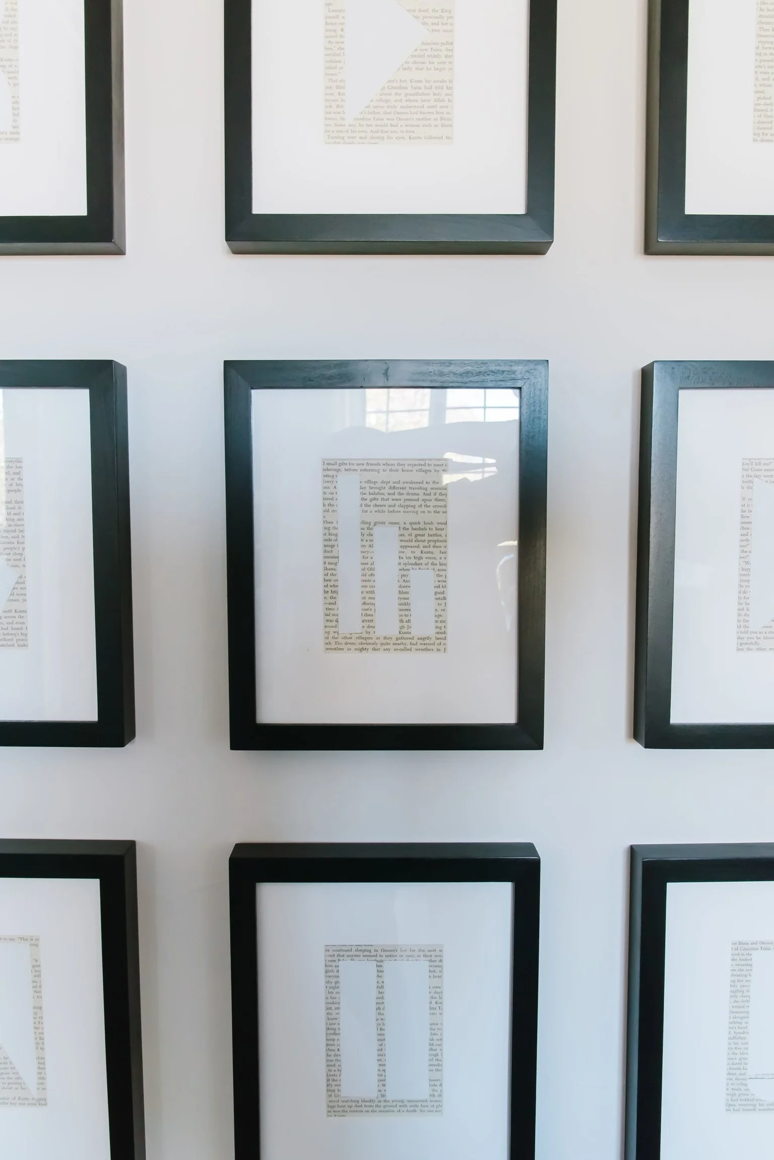
The artwork in this room is another gorgeous piece that helps tie all the spaces together. The dark tones bounce throughout - from the artwork to the chandelier, to the black frames on the gallery wall, to the black iron doors in the entry.
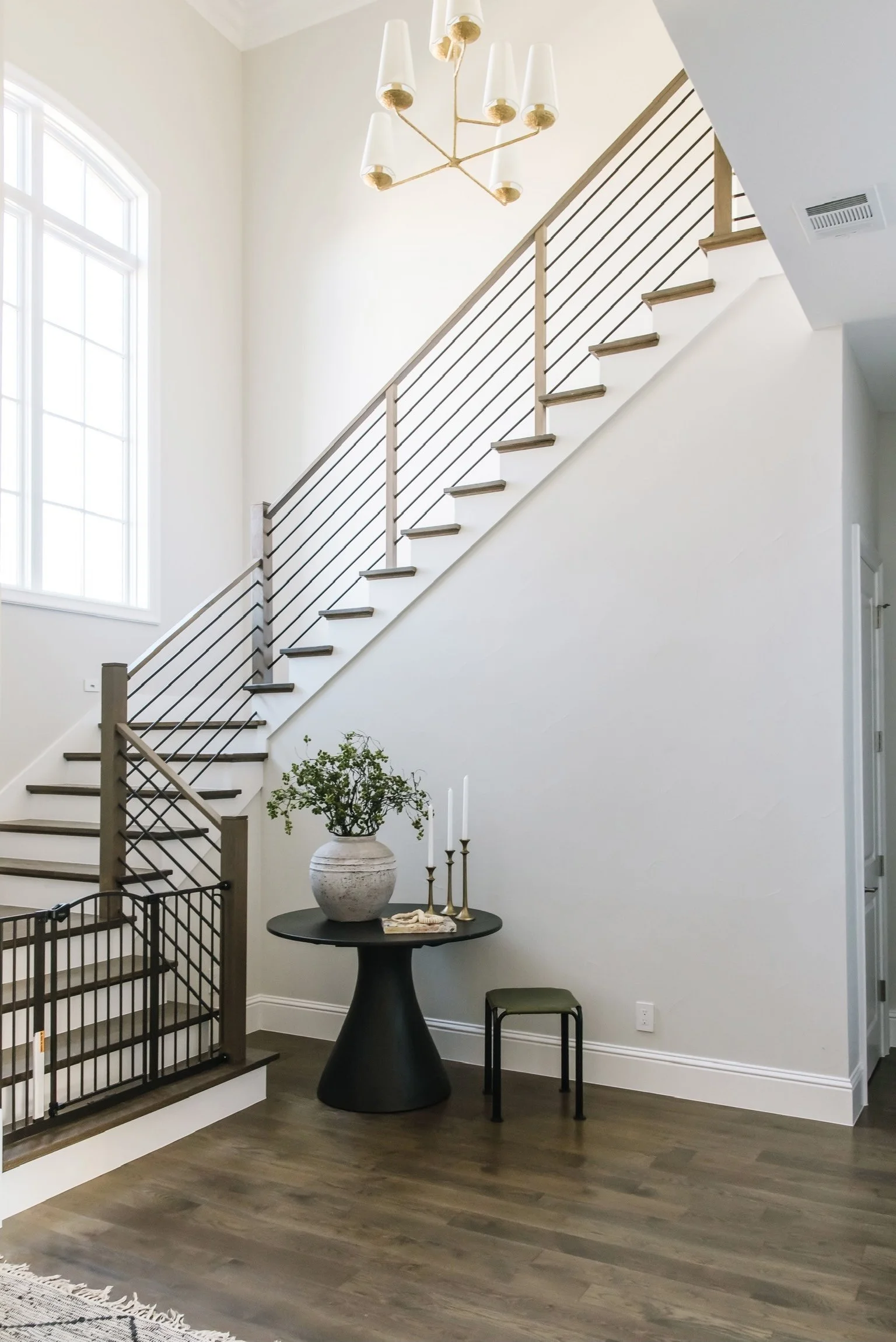
Moving into the entry, we’re greeted with an amazing vaulted ceiling and open staircase. Again, the chandelier adds a just-right touch of luxury to the space.
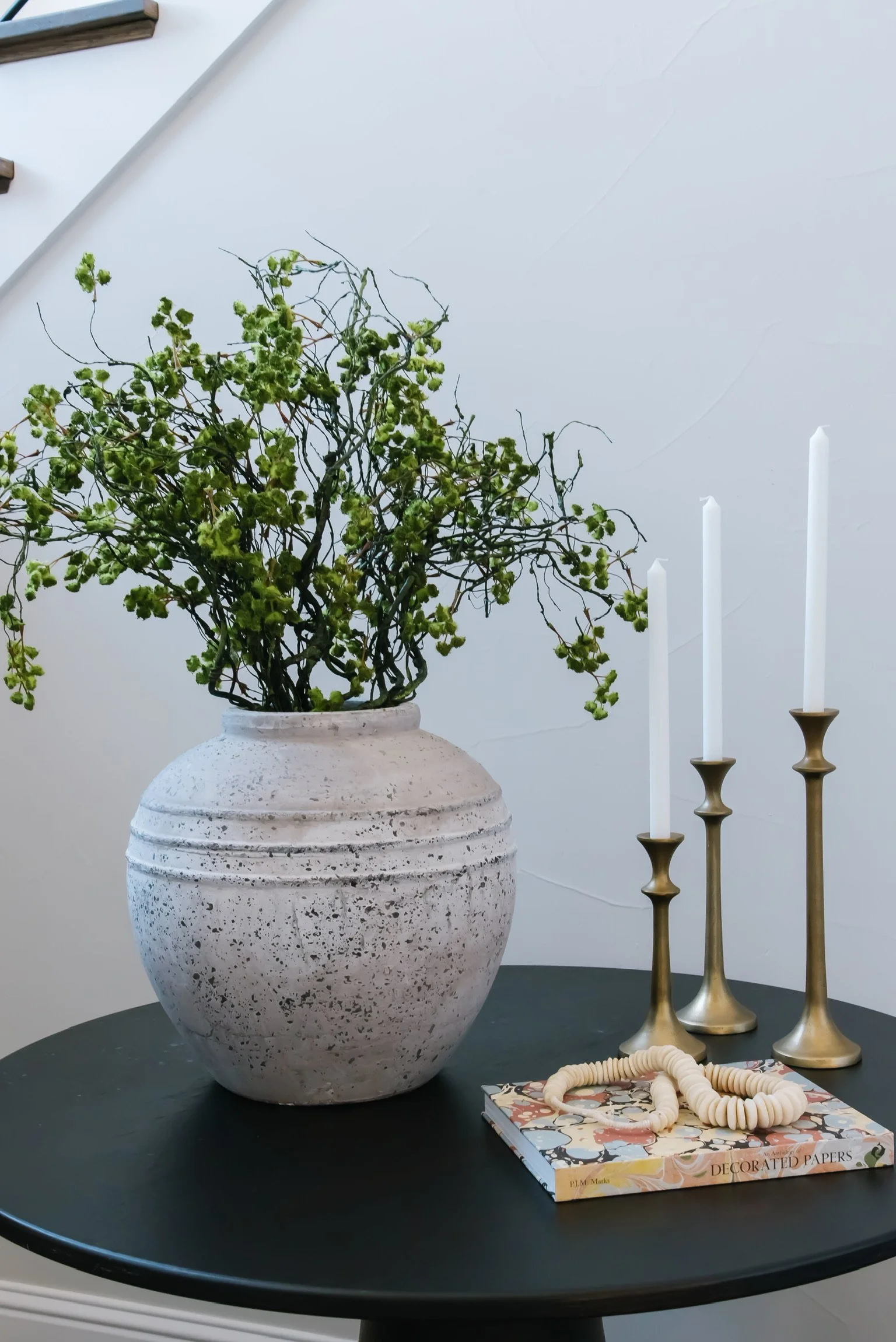
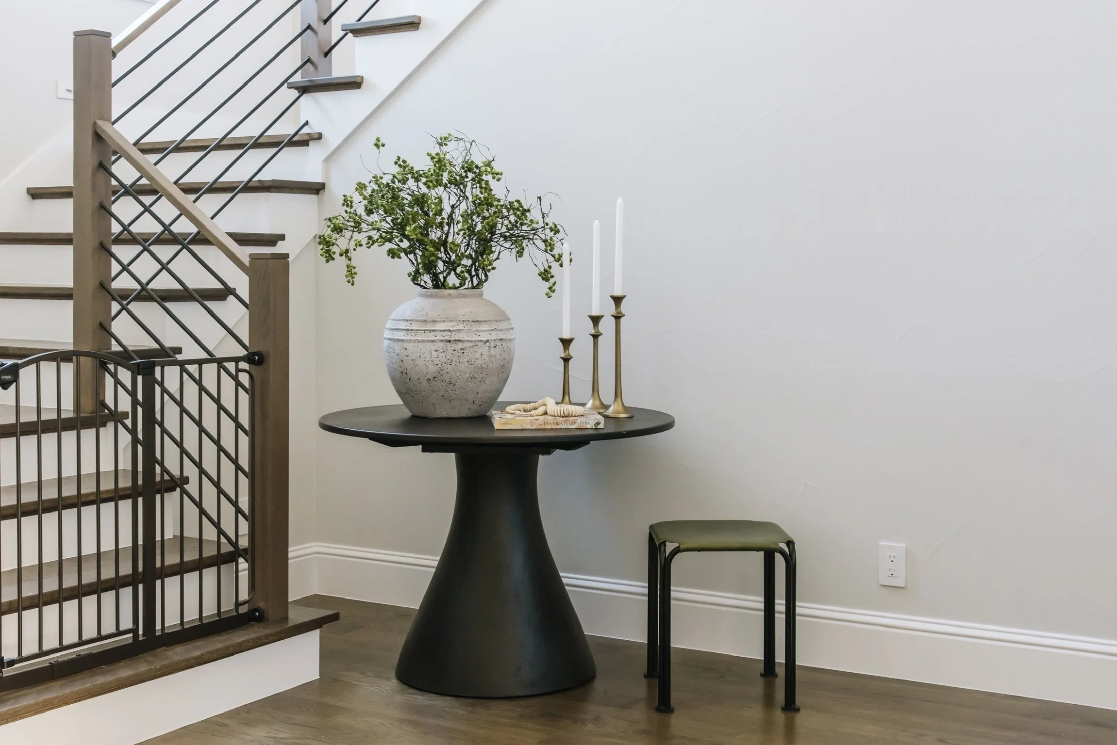
We brought in a stunning black side table and a fun green stool. We really love the texture and warm, earthy vibes of the vase and greenery.
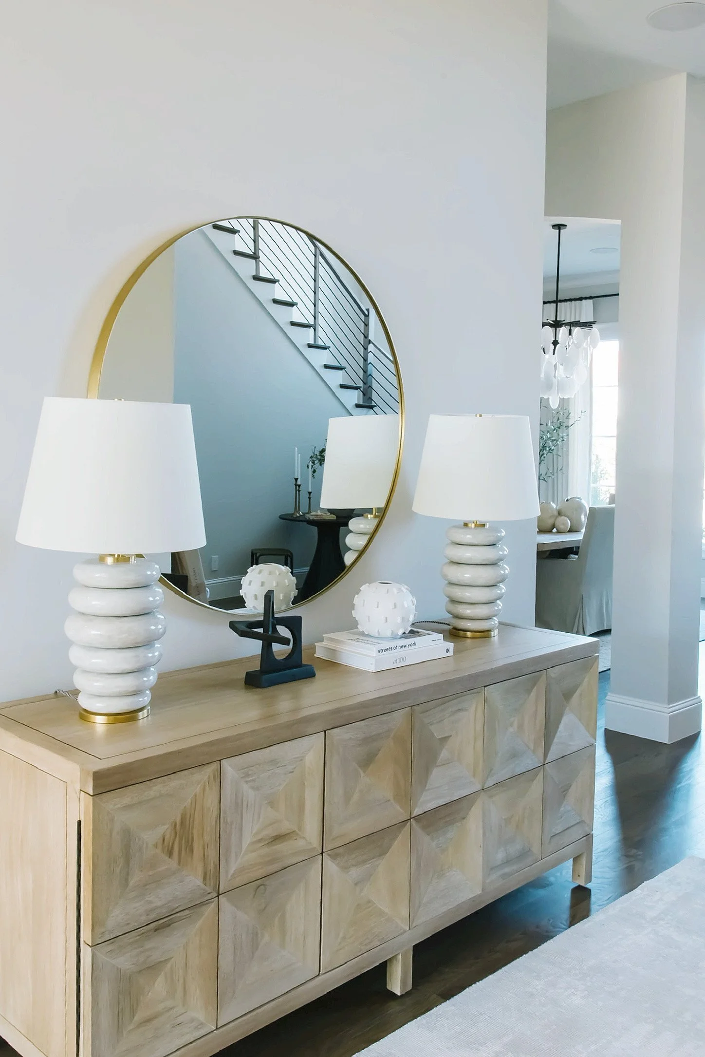
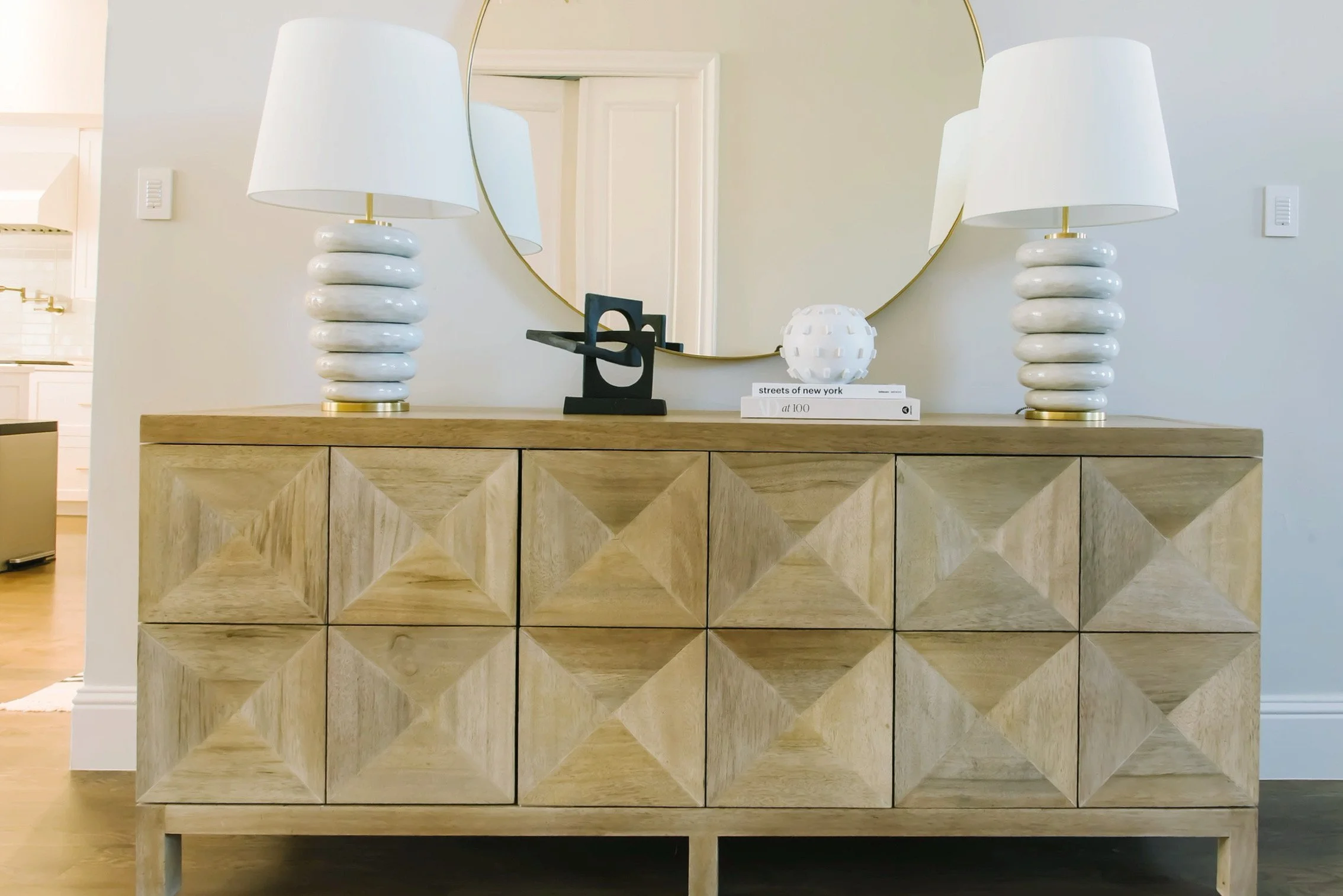
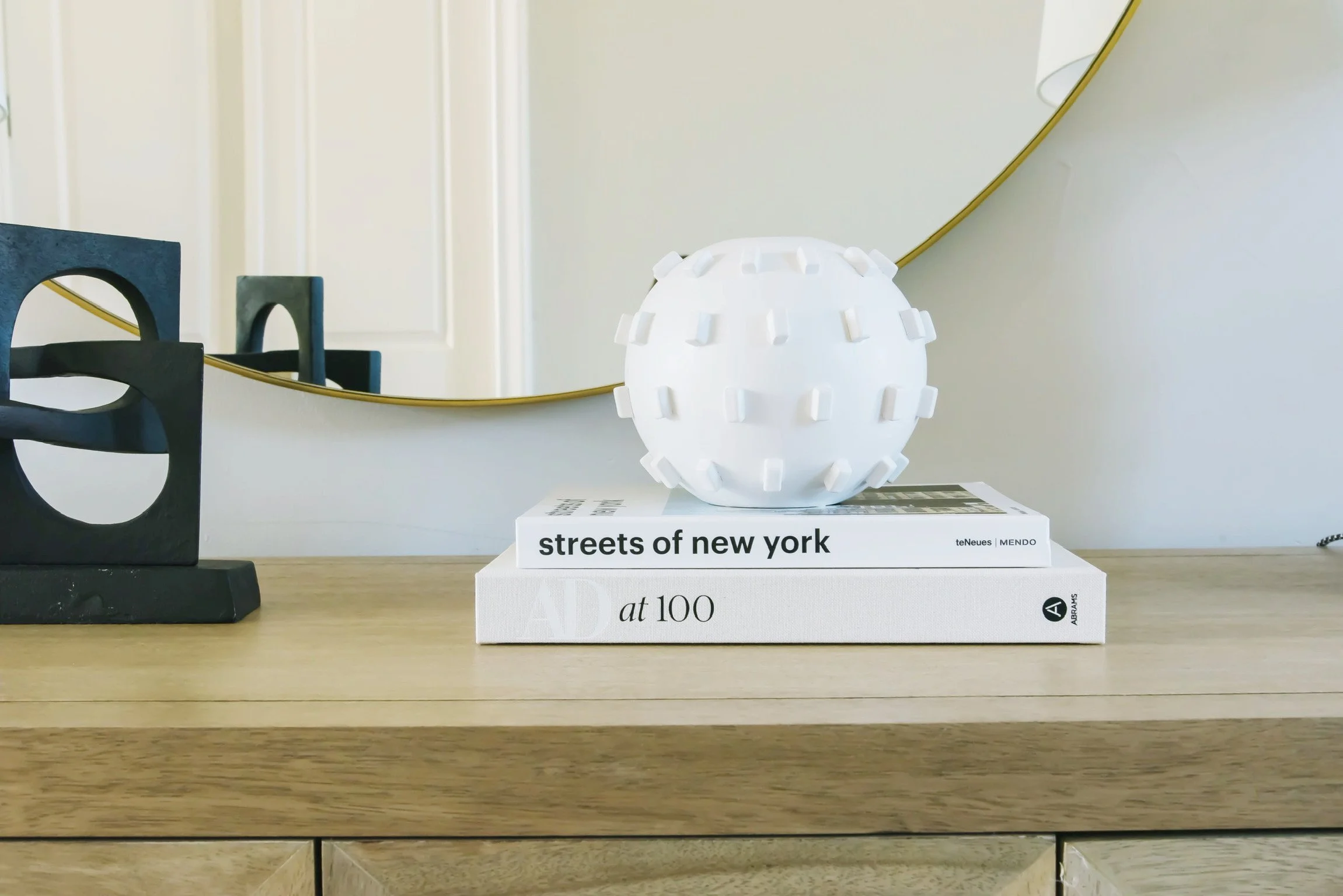
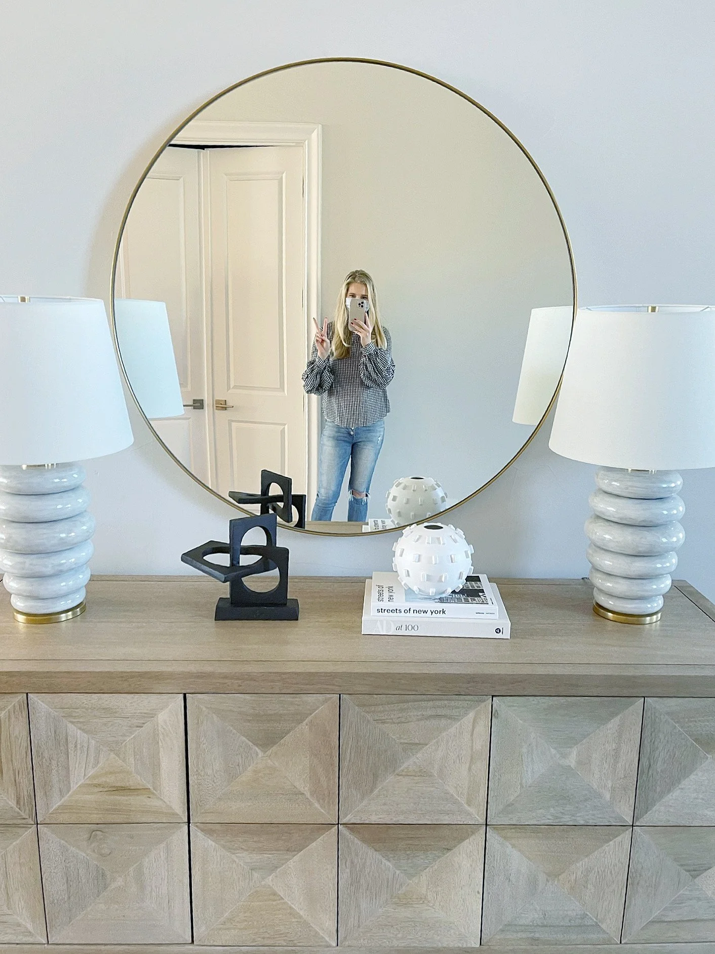
We were able to create another moment in the entry just a few more steps in before coming to the great room. We love this moment for it’s amazing credenza, which again is so beautiful and practical for storage. The brass mirror and pair of modern lamps made for a winning combination that elevated the design.

