The Weekly Edit - 7/30
The Weekly Edit - 7/30
Celebrating our rebrand & the launch of our new website, sharing the inspiration behind the refresh and a behind-the-scenes sneak peek at our Bristol Project photoshoot.
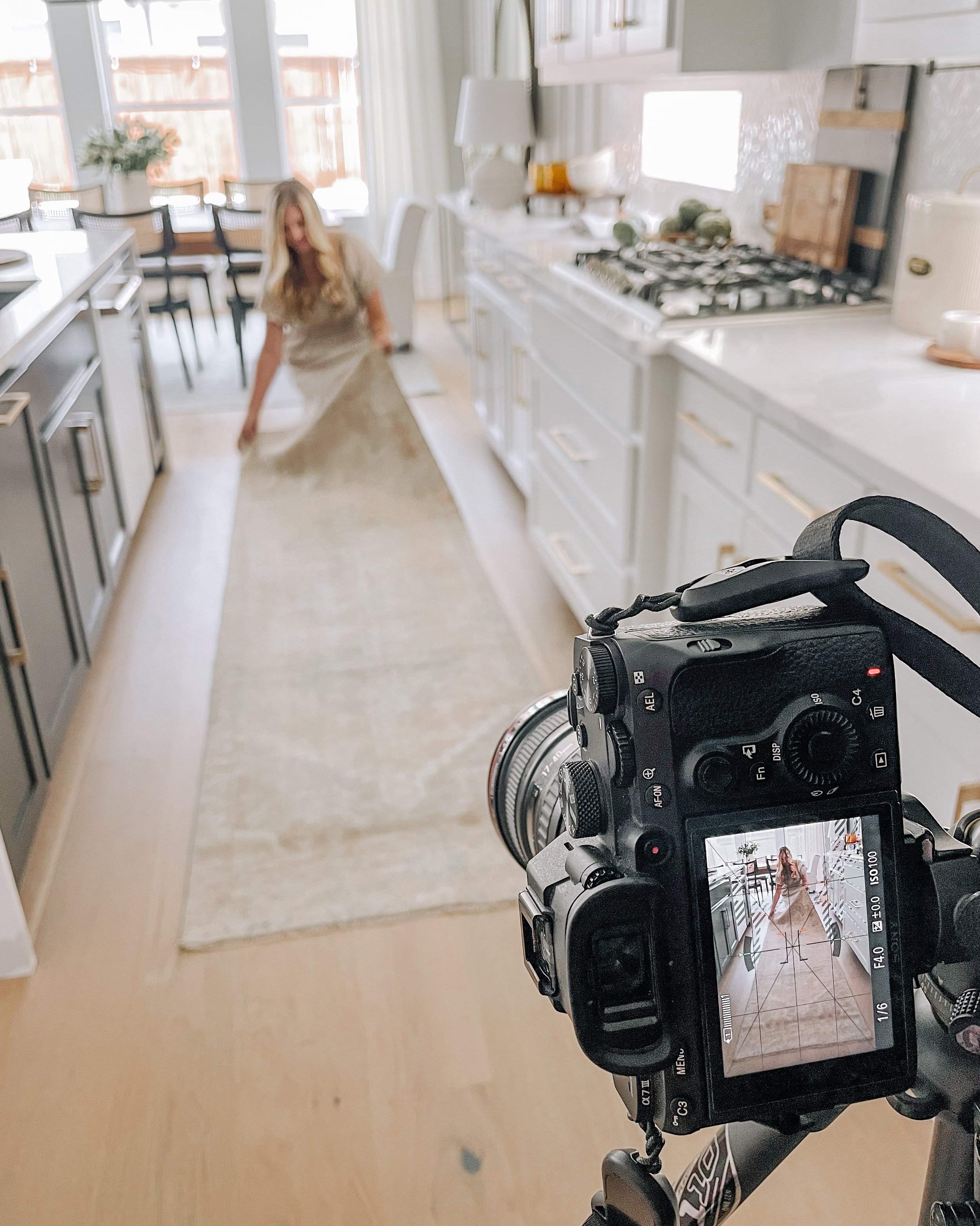
HS Project: BRISTOL PROJECT PHOTOSHOOT SNEAK PEEK
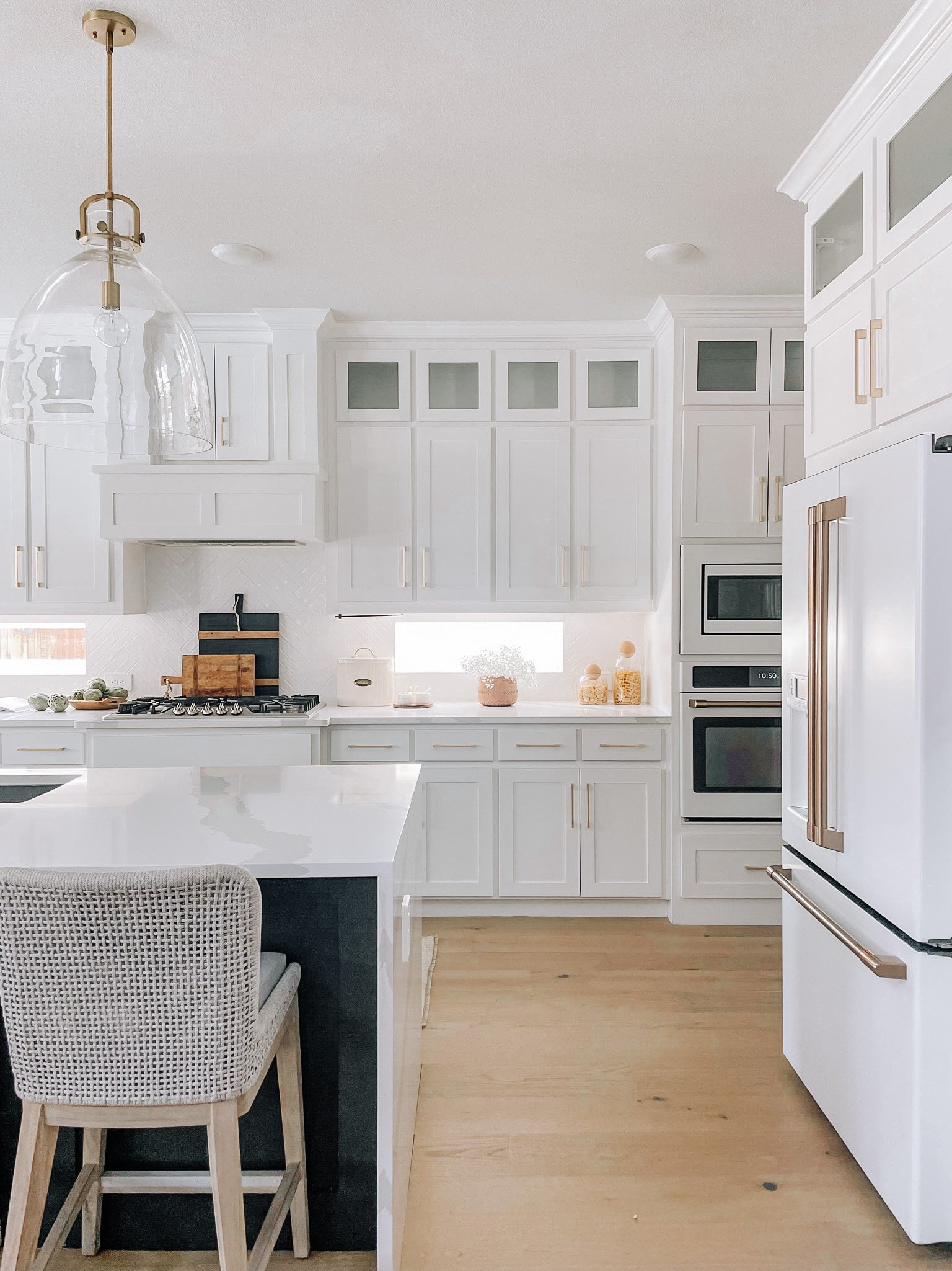
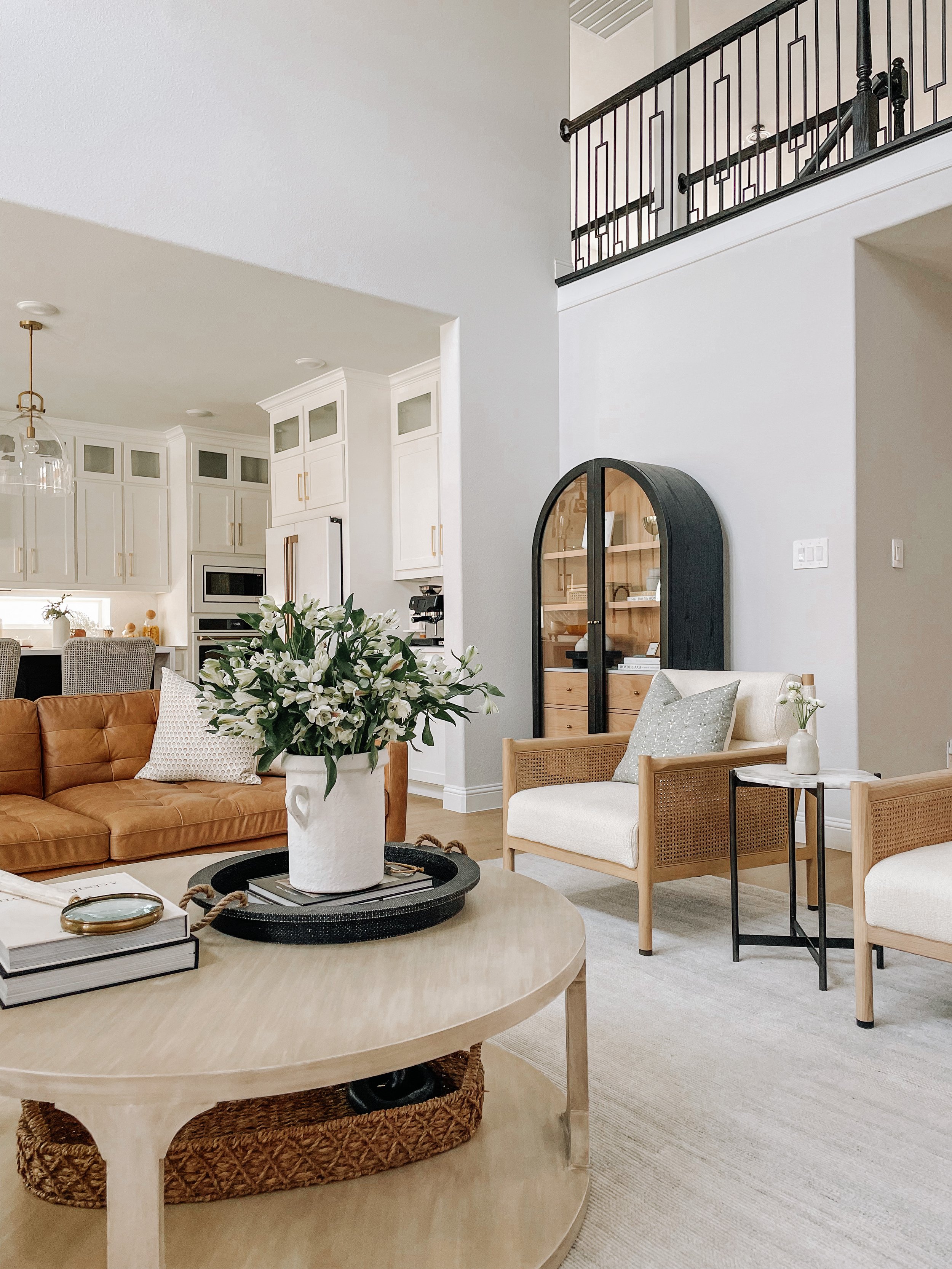
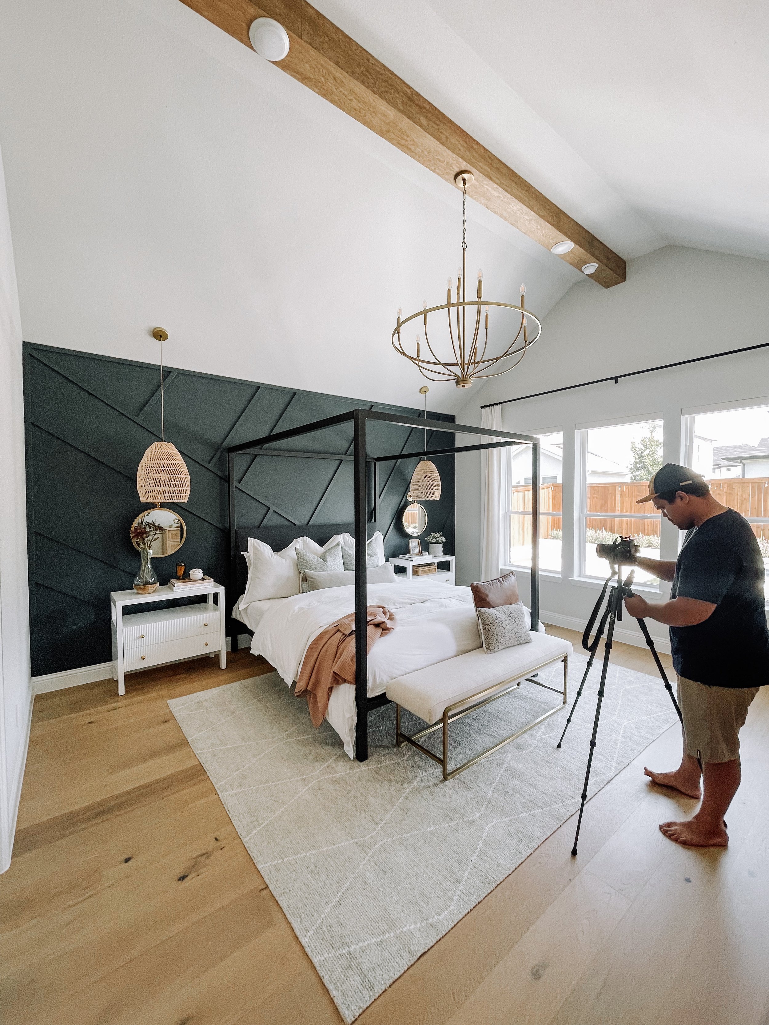
We had so much fun going on-site to our Bristol Project this past week for a photoshoot! These days are always so inspiring as we get to see our projects come to life through a new perspective behind the lens. For this project we photographed the entry, office, primary bedroom, great room, kitchen and dining space so it was a full day with all hands on deck!
This beautiful home is located here in the DFW area and was a full A to Z project where we helped with new construction details, furnishings & accessories and window treatments - such a fun one to work on with our amazing clients! One of the things that we love the most about this project in particular is the large open floor plan that flows from the great room right into the kitchen & dining space. Whenever you have spaces that open to one another, it's the perfect opportunity to incorporate design layers. Thanks to the open hallway overlooking the great room, we were able to get creative when capturing this space to really show the grand-ness of the layered rooms.
Another thing that is special to this home is the wall treatments and moody accent colors chosen for the Primary Bedroom, Dining Room and Office. By incorporating these wall treatments, we were able to add contrast and texture into each space which further played a role in the overall design layers carried throughout the home.
We're so excited to start revealing this project in the upcoming weeks, but in the meantime, enjoy these behind-the-scenes sneak peeks!
HS Update: OUR NEW WEBSITE & RE-BRAND IS LIVE!
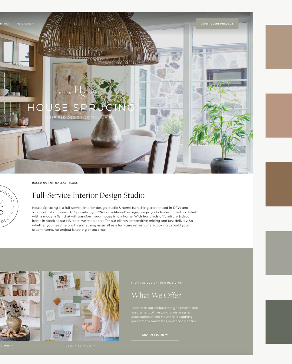
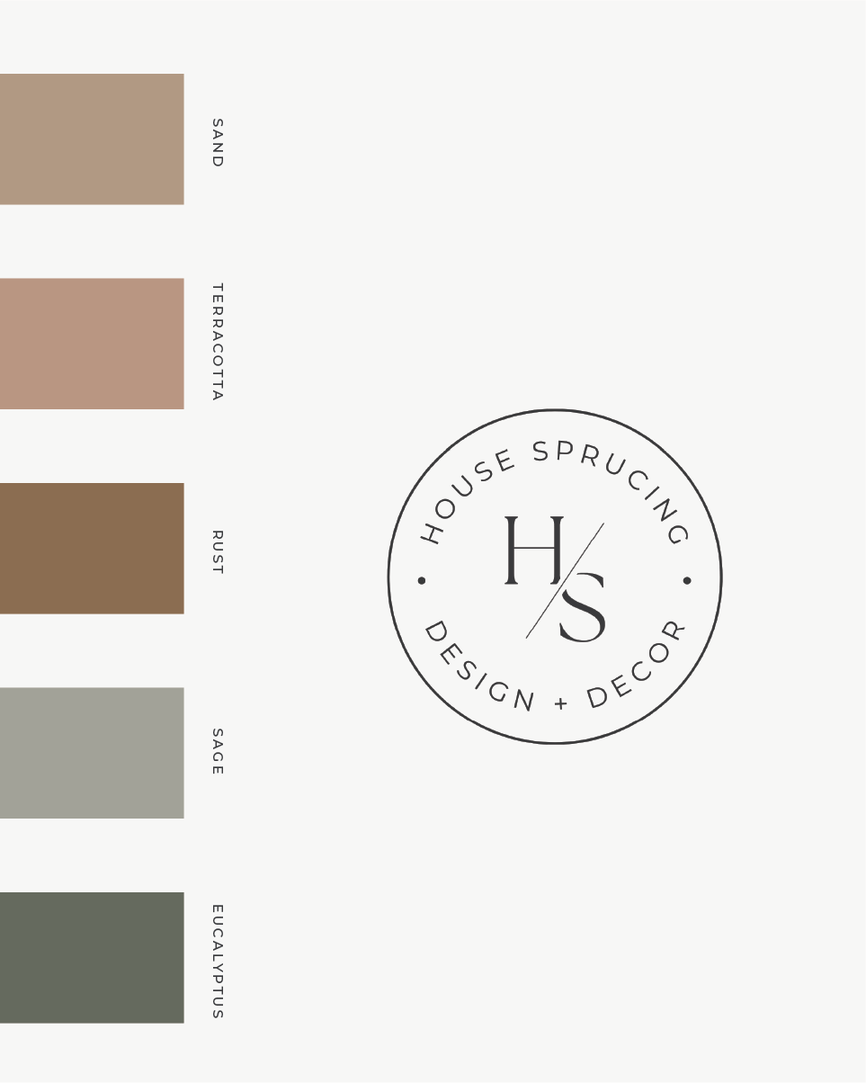
Our new website & re-brand is here and we couldn't be more excited to reveal our fresh new look! This project has been in the works for the past few months and is so fulfilling to see come to fruition. Everything from the colors, typography and logo design were intentionally chosen to bridge our design projects and brand together for a seamless experience and recognizable look.
Perhaps one of our favorite features (of many!) on our new website is our portfolio. If you'd visited our previous website, you know that we didn't have a portfolio that was designed to showcase each individual project so revamping our portfolio page was high on our wishlist for the new site. Our new design portfolio beautifully showcases each individual project and features a "Shop the Look" section with all of your favorite products from the HS Store that will eventually be available for purchase online once our e-commerce website is finished - we know you have all been waiting patiently for e-commerce and we promise, it is in the works and coming soon!
There are so many things to explore on this new website (including projects images we've never shared before) and we can't wait for you to dive in and check it out.
In celebration of the new website & re-brand, we've chosen one lucky winner to receive a FREE e-design & consultation with Heather! A big congrats to Whitney Nelson - you are the winner of our giveaway! We will be contacting you via Instagram DM's to coordinate and get you started on your design - we're so excited to work with you and bring the HS look into your home!
HS Store: Christmas in July
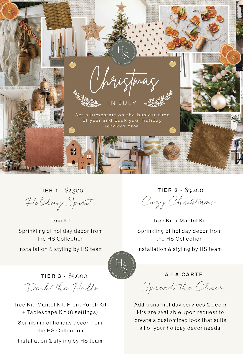
Don't forget, it's still Christmas in July! Get a jumpstart on the busiest time of year by booking your holiday design services now. We'll save you time, stress and money by curating a beautiful customized holiday look that is unique to you and your home. Explore our holiday service packages and be sure to book by August 15th to save 10% on your package! Email hello@hsdesignteam.com to inquire & book your services.
INSPIRED BY: OUR NEW WEBSITE & REBRAND
With the launch of our new website & re-brand, we're full of inspiration this week surrounding our fresh new look and wanted to take a deeper dive and share more about the inspiration behind our rebrand and website launch.
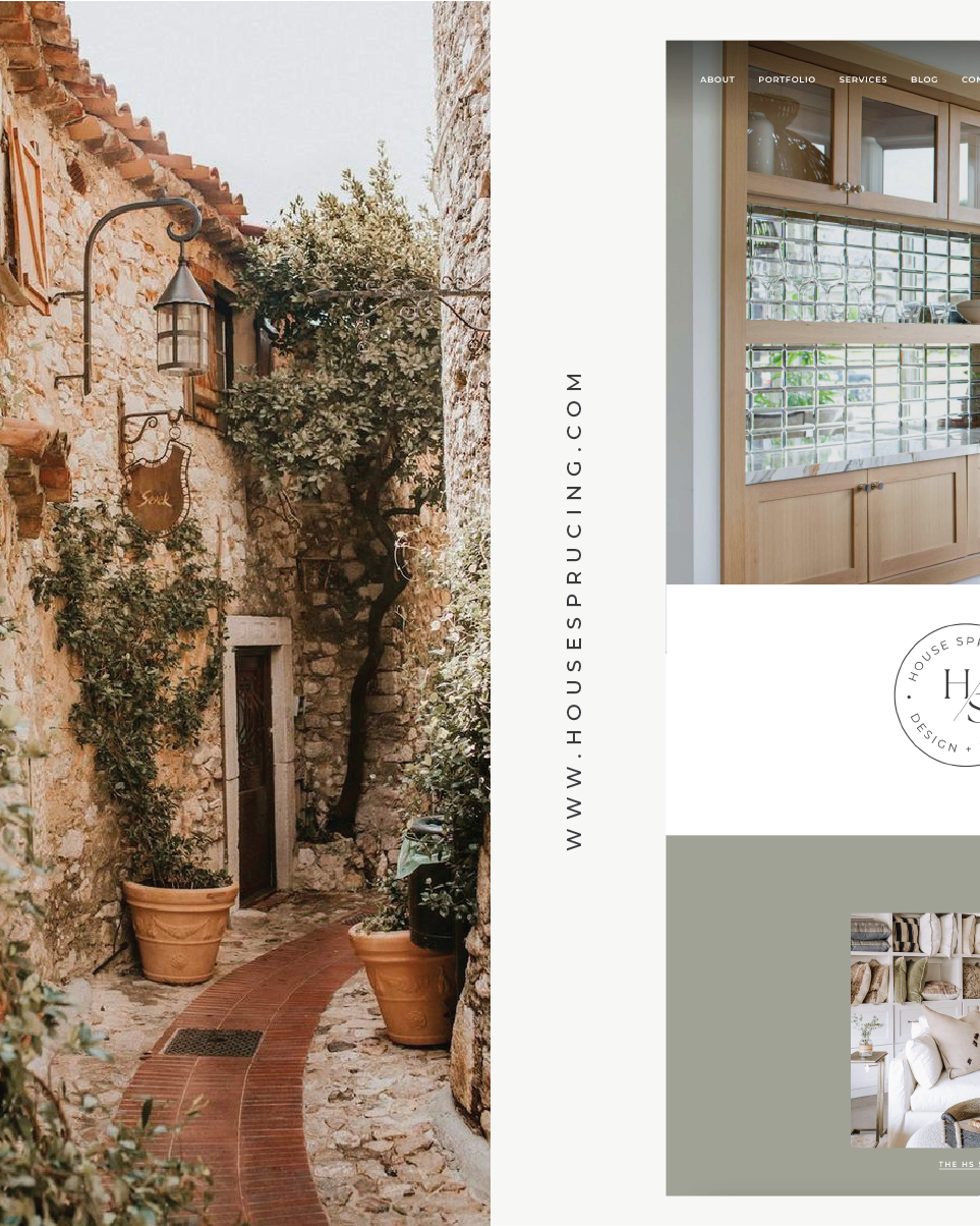
As many of you may or may not know, Tyson and I are extremely passionate about travel - in fact, we lived abroad for a few years and have traveled to 50+ countries! I've always been so inspired by the colors, textures, patterns and architectural details found in European design and have found that this inspiration has carried into our "New Traditional" design style here at HS. If you scroll through our design portfolio, you'll find a few common themes - texture & color being the most prominent. Because of my love for Italy and the south of France, many of our designs are infused with hints of greens, blues and terracotta and feature natural textures such as cane, seagrass and rattan all of which have been inspired by the Mediterranean.
Keeping that in mind, it only made sense to build our rebrand around these core colors and to refine our typography with fonts that are both textured and clean to share our brand's story.
Overall, the goal of this rebrand was to create a seamless experience so that no matter where you find us (whether it's Instagram, a Google search, press feature, etc.) you'll be able to recognize our look and get a feel for our design aesthetic.
Take a look at some of the moodboards that were designed for the rebrand and join us in savoring this pretty inspiration!
Favorite Things: SHOP THE PROJECT
In spirit of the new website and our portfolio "Shop the Look" feature, this week's favorite things are highlighting HS pieces found in one of our HS Projects - the Dallas Penthouse Project! Tap through to shop the HS pieces styled in this beautiful, minimalist home and feel free to send us a DM or email for purchasing details.


