Timberlake Project Primary Bedroom & Bathroom Reveal
Timberlake Project Primary Bedroom & Bathroom Reveal
Design
Our clients found this beautiful home in the country, but it was a little too traditional for them. That’s where we came in. They wanted us to create a moodier and more customized look that really represented their family and their vibe.
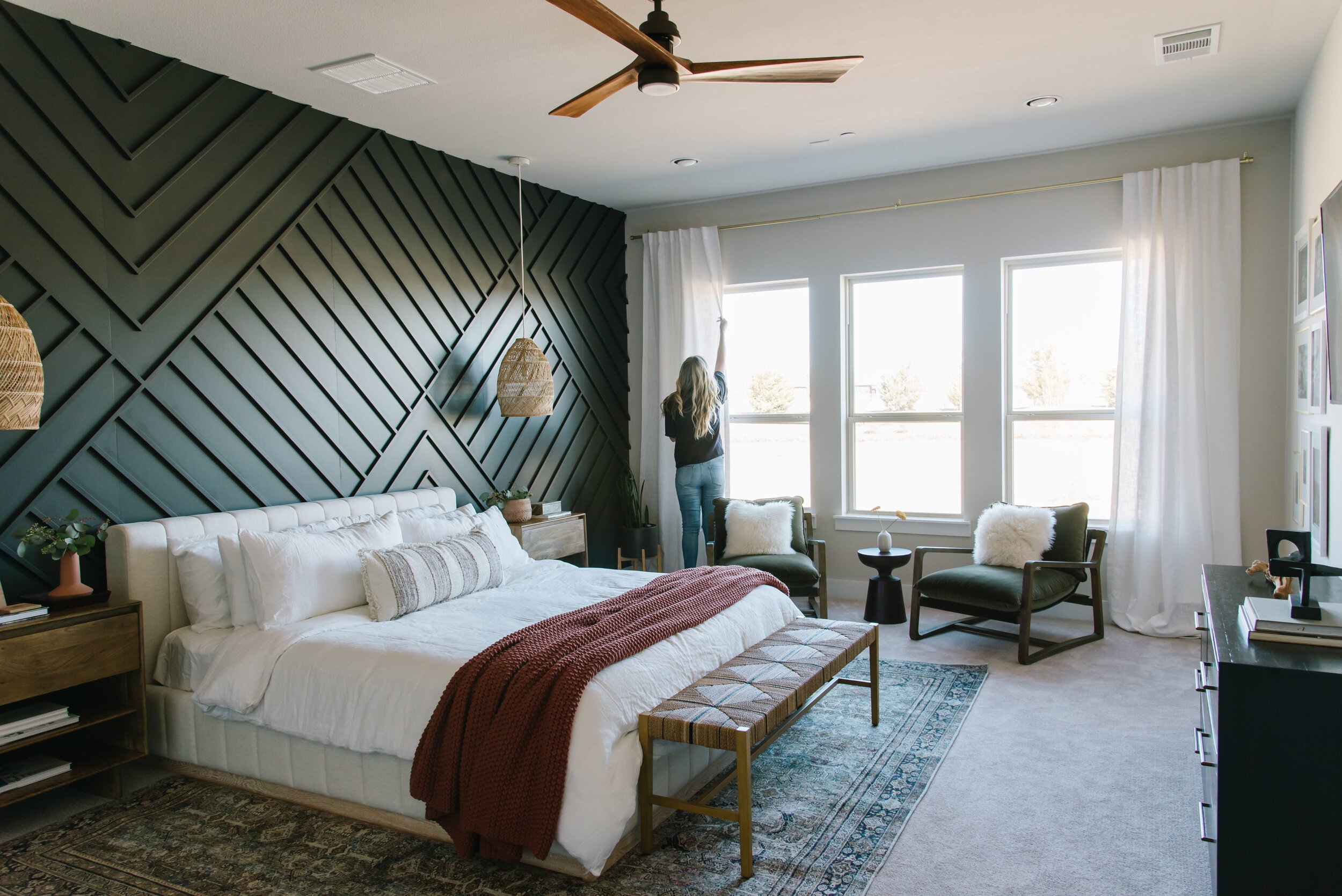
Today we’re starting in the primary bedroom and bathroom. In the bedroom, we did a really cool feature wall. We chose this awesome geometric pattern and added some great mood with the dark charcoal color, capturing the vibe the client was going for.
The depth that this dark charcoal feature wall brings is really great because we were able to bounce other moodier and unique items of the furnishings off the wall.
Next up was to space plan. Our team came in and really optimized the space to make sure everything was scaled properly and looked just right.
We brought in these really cool moody green chairs that have this leather detail. They’re warm and luxurious and are a great way to add some furnishings into this open space in the bedroom.
Something that was so unique that we did was we dropped these pendants down from the ceiling that have this really cool basket detail on each side of the bed.
We wanted to seamlessly carry the theme of the bedroom right into the bathroom. The feature wall’s geometric lines are echoed in the lines of the tile pattern as well as it’s dark color in the vanity countertops. We also love the brass fixtures and chandelier in the bathroom and how they really worked harmoniously together with the brass detailing in the bedroom.
The fun patterns in the textiles also were echoed throughout in the pillows on the bed, the details on the bench, and the pattern on the bathroom rug, bringing the two spaces beautifully together.
The clients really loved how both spaces turned out. They were glad that we kept their cool modern vibes throughout and were super excited they moved forward with the feature wall. Originally, they were hesitant about the investment of a feature wall, but in the end, they saw how investing in this piece brought the space all together and added really great design depth.


