The Cottonwood Project Kitchen Reveal
The Cottonwood Project Kitchen Reveal
Design
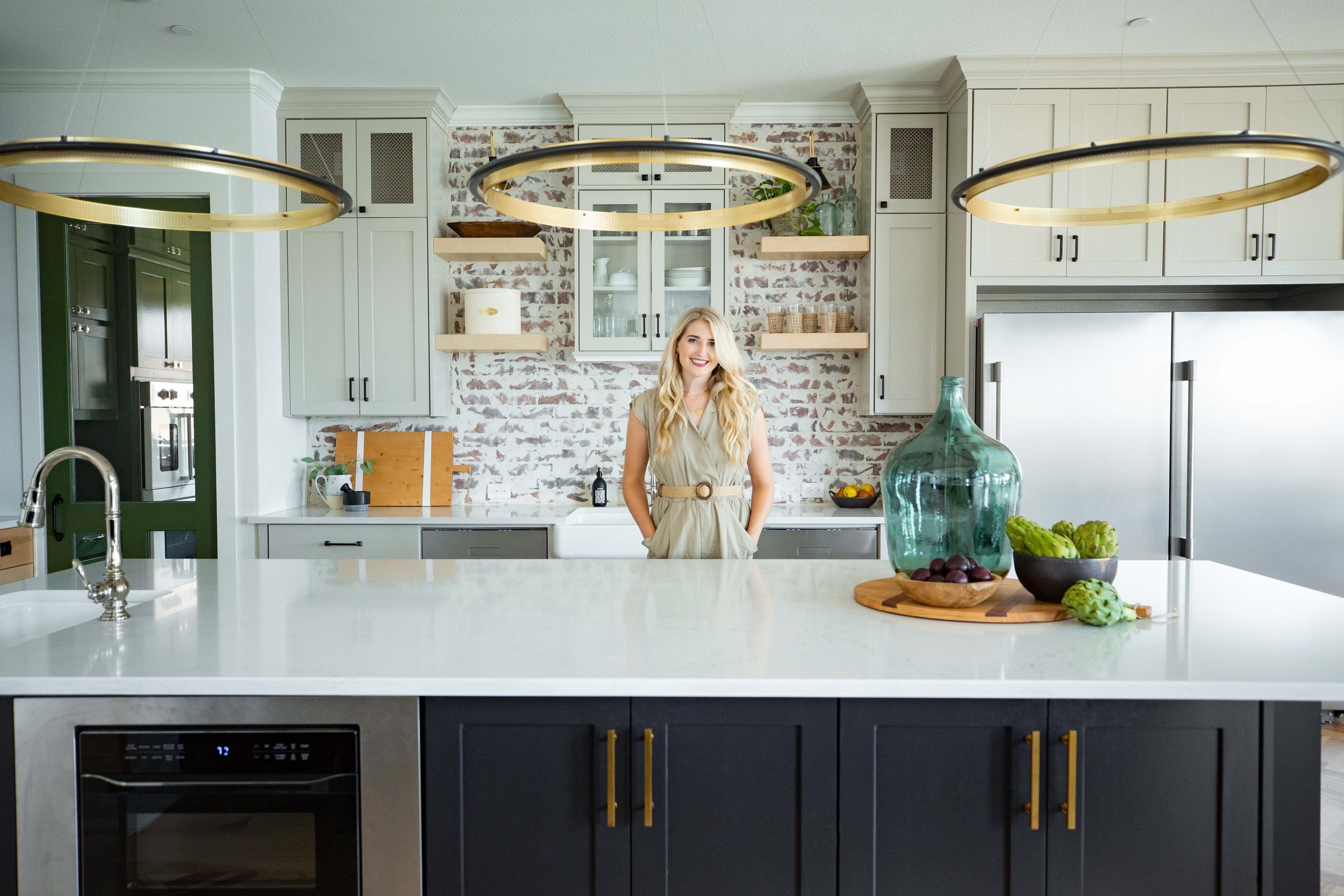
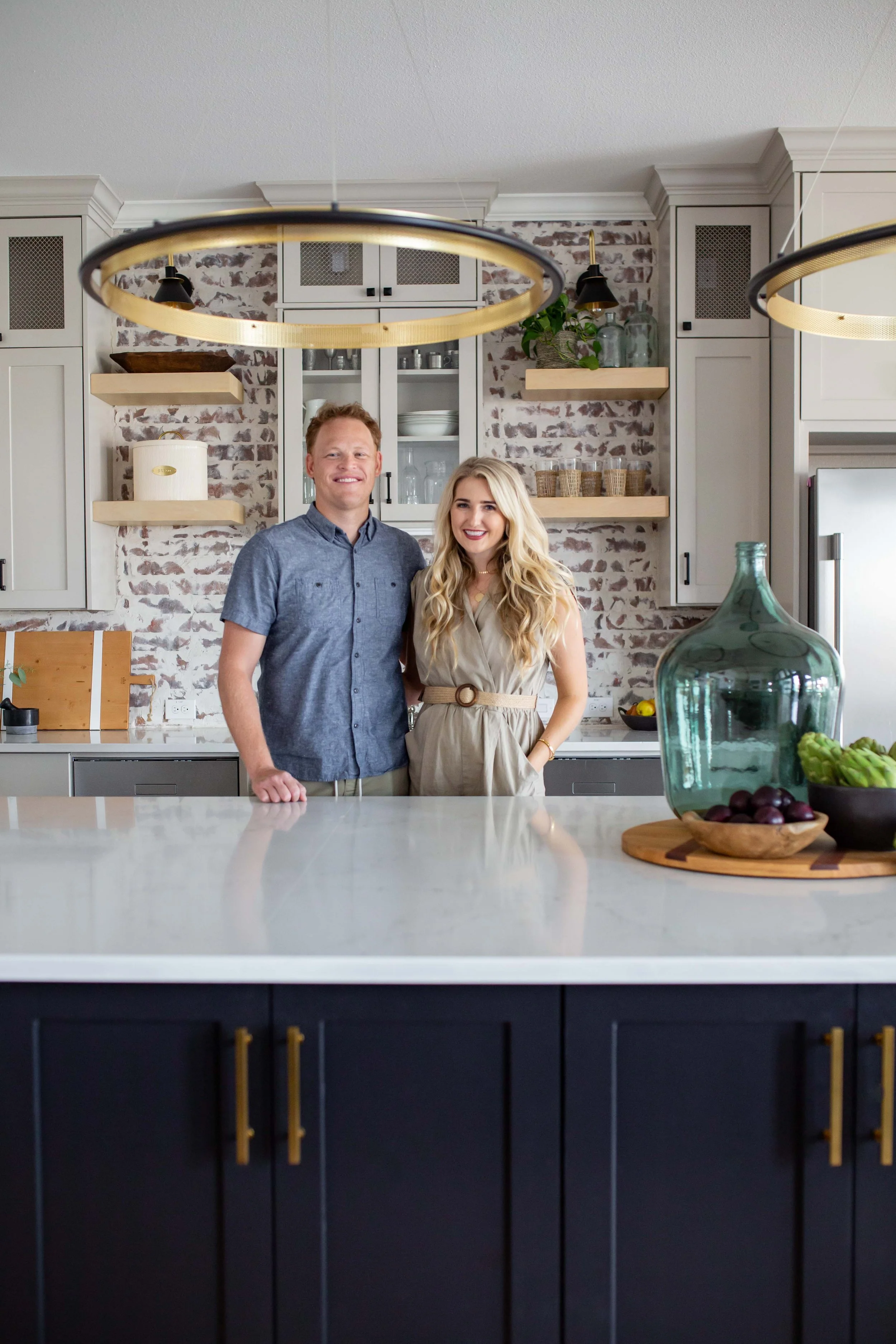
Today we are so excited kick off our latest launch with our Cottonwood Project! This project has been so much fun to work on and we’re beyond excited to start with the kitchen reveal. If you’ve been following along on Instagram, you’ve seen some progress updates and sneak peeks and know that this is a good one. So come on in, we hope you love it as much as we do!
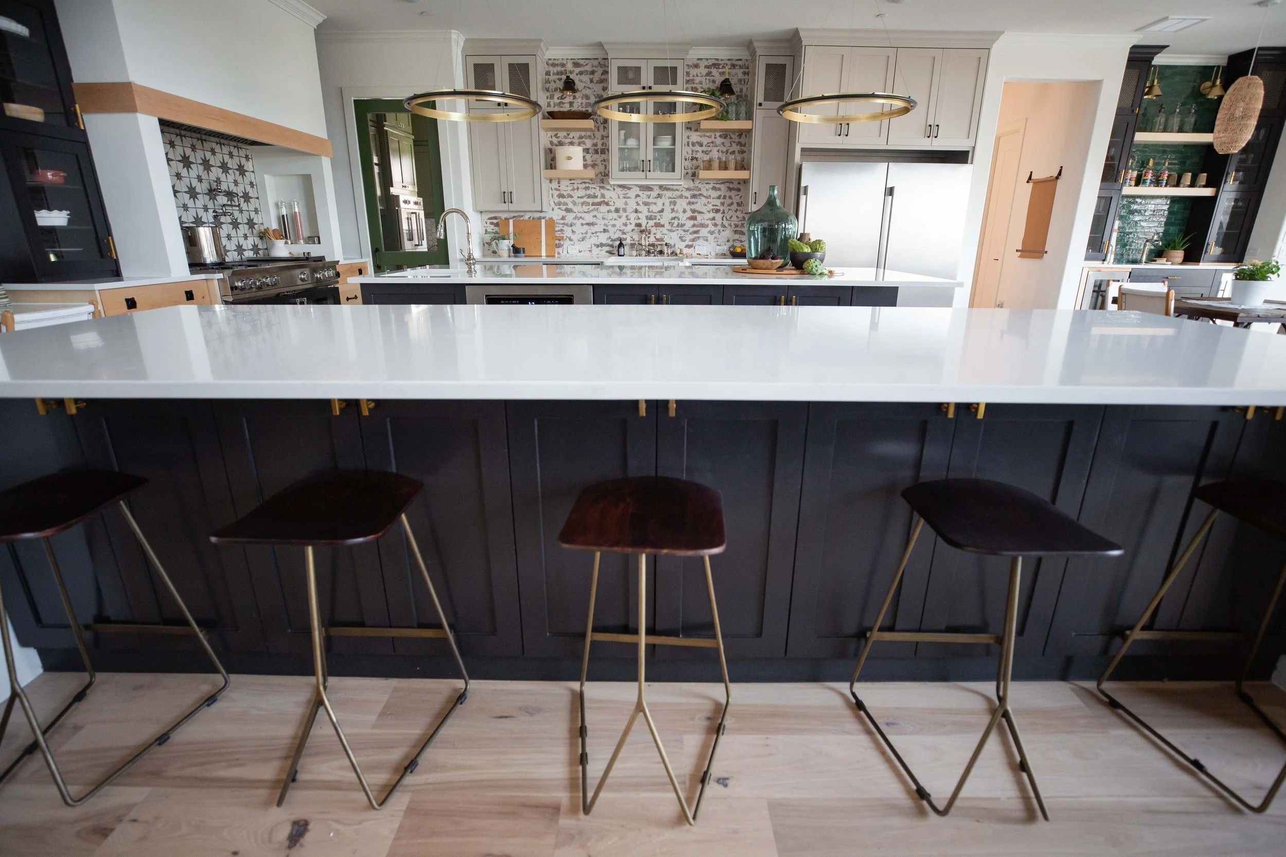
Our clients for this project are so full of life and they have a wonderful family. They really wanted this home to be a gathering place for anyone to come. This kitchen is such a great example of how to create a space that the client wants to thrive in. They want to host and gather people and we had a big tall order to get as many people into this space as possible.
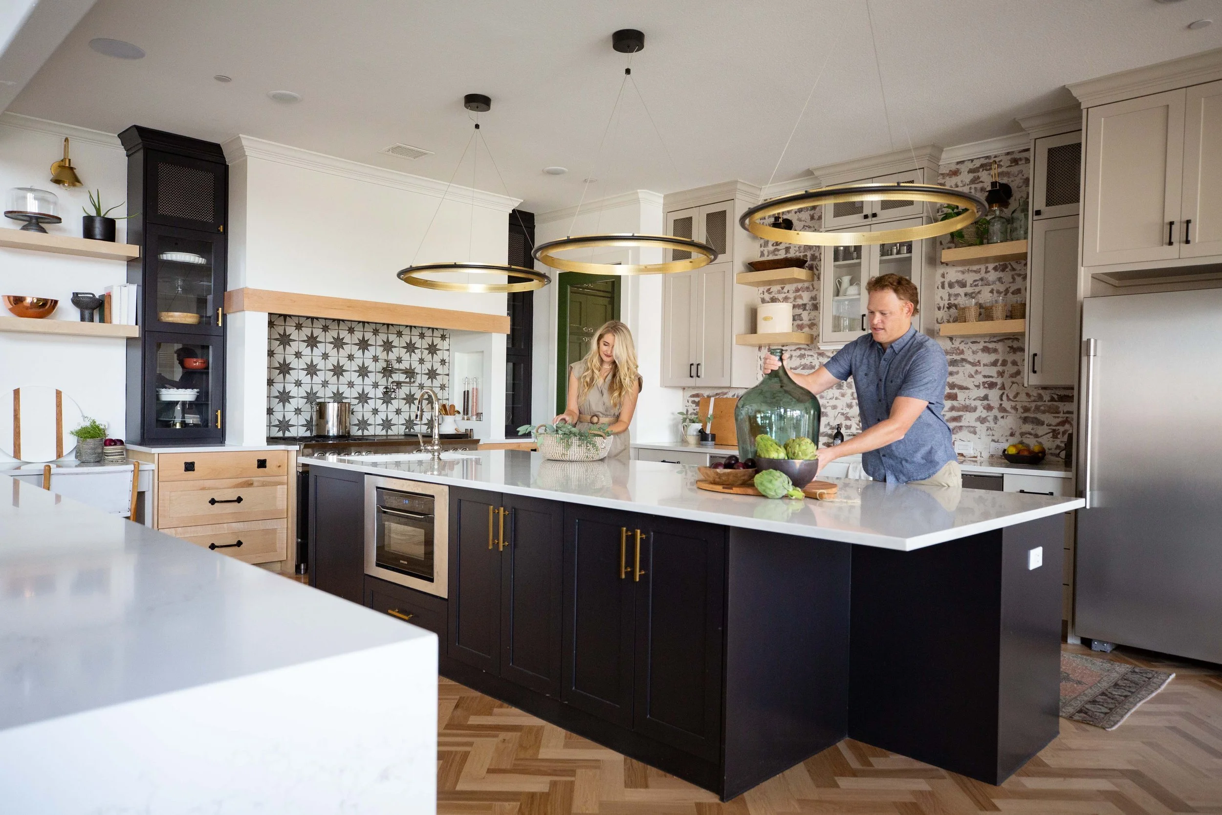
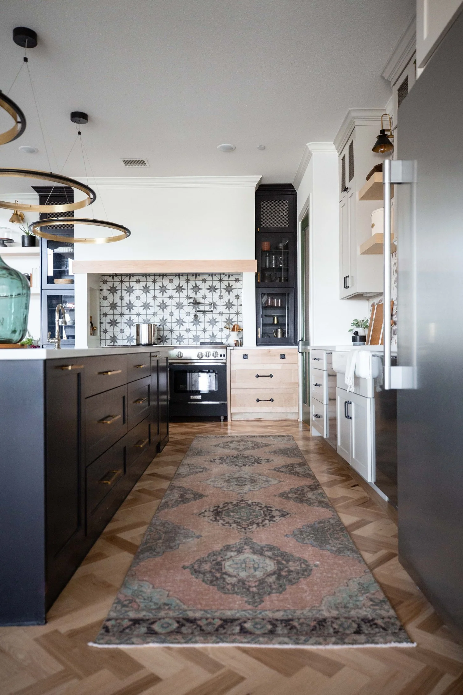
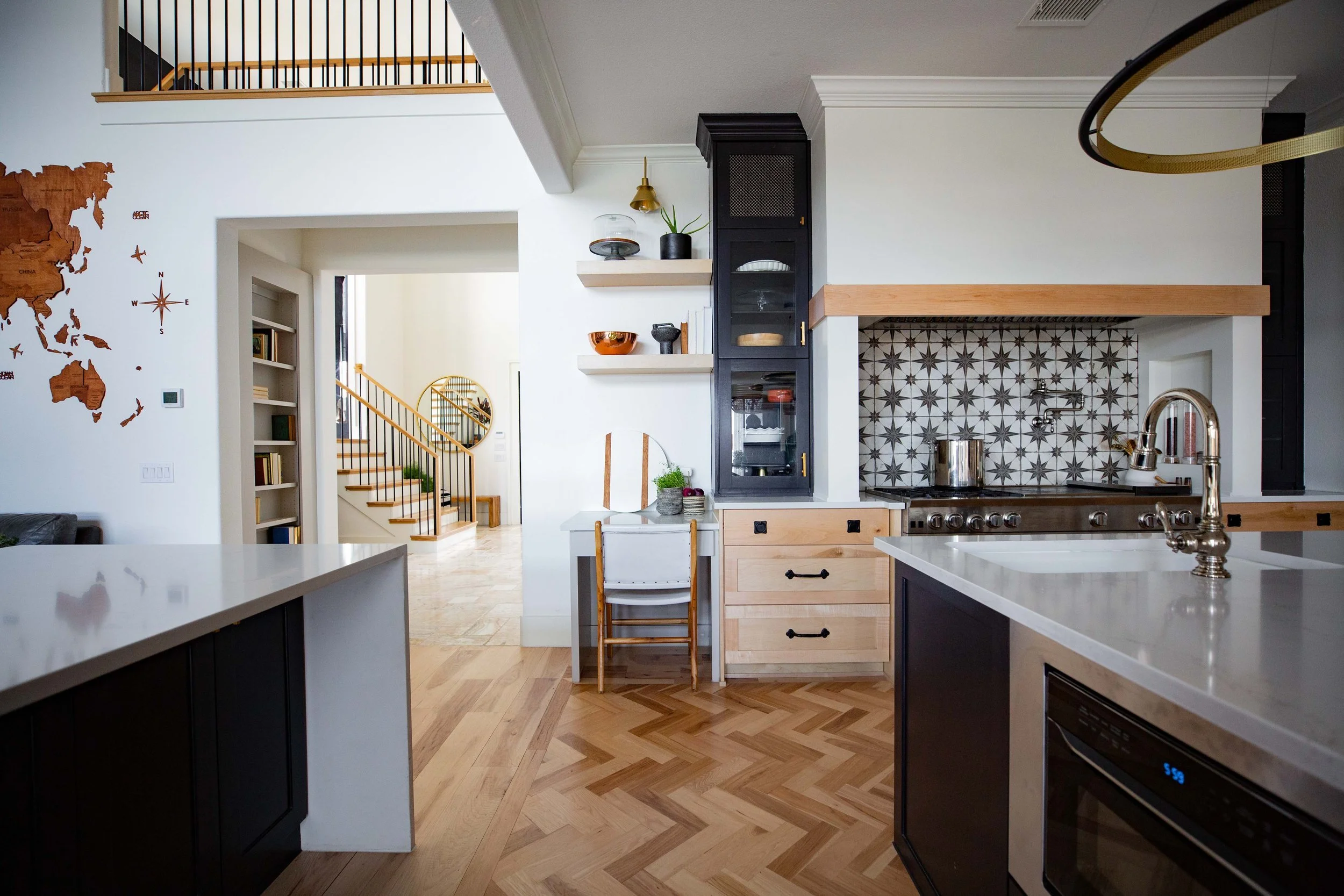
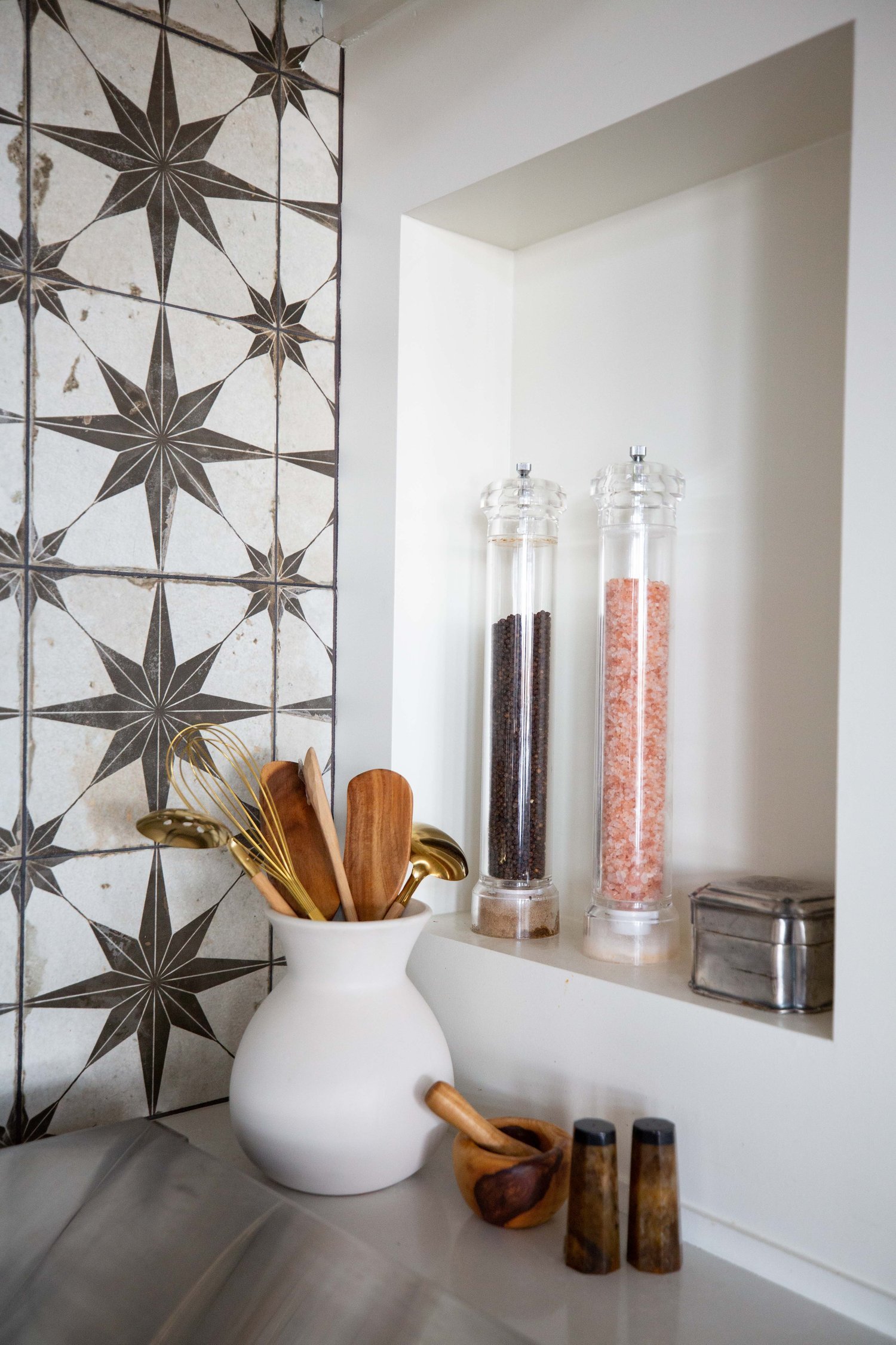
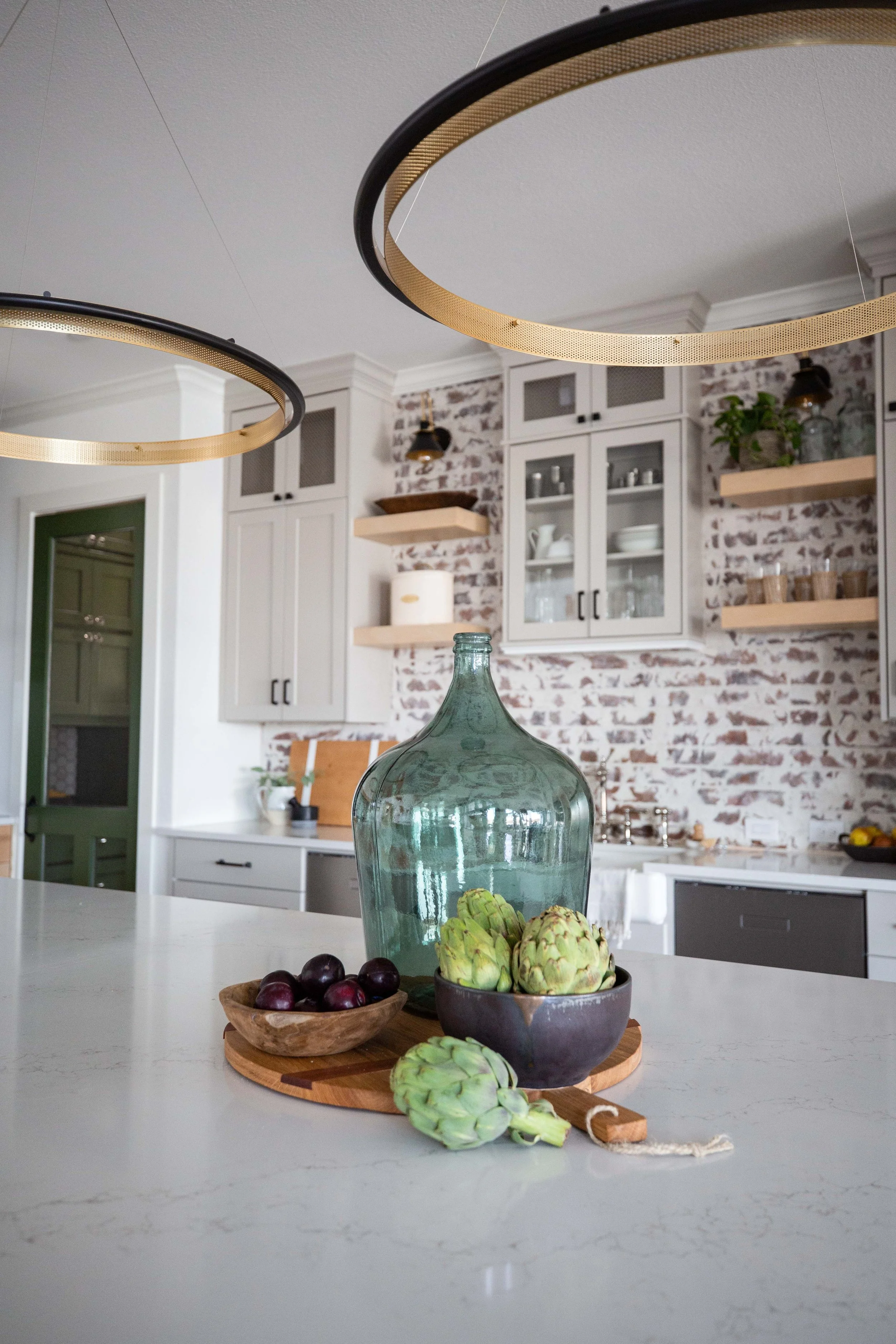
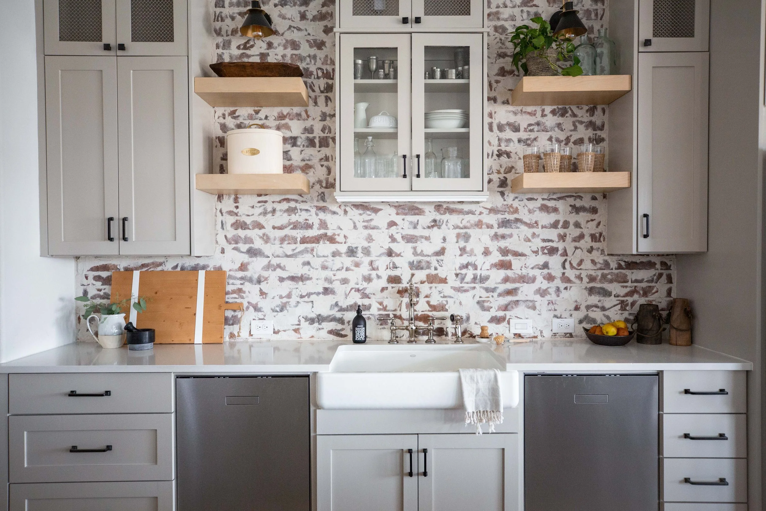
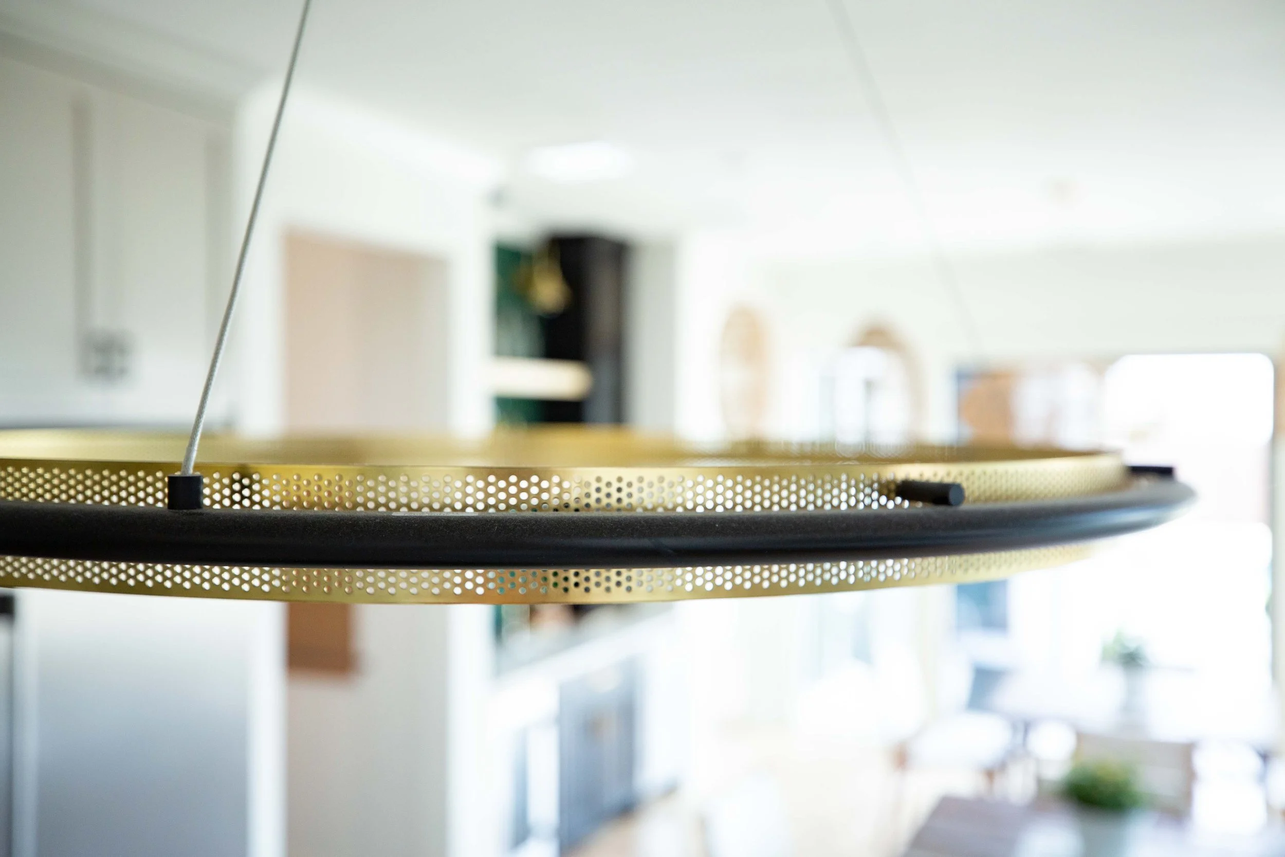
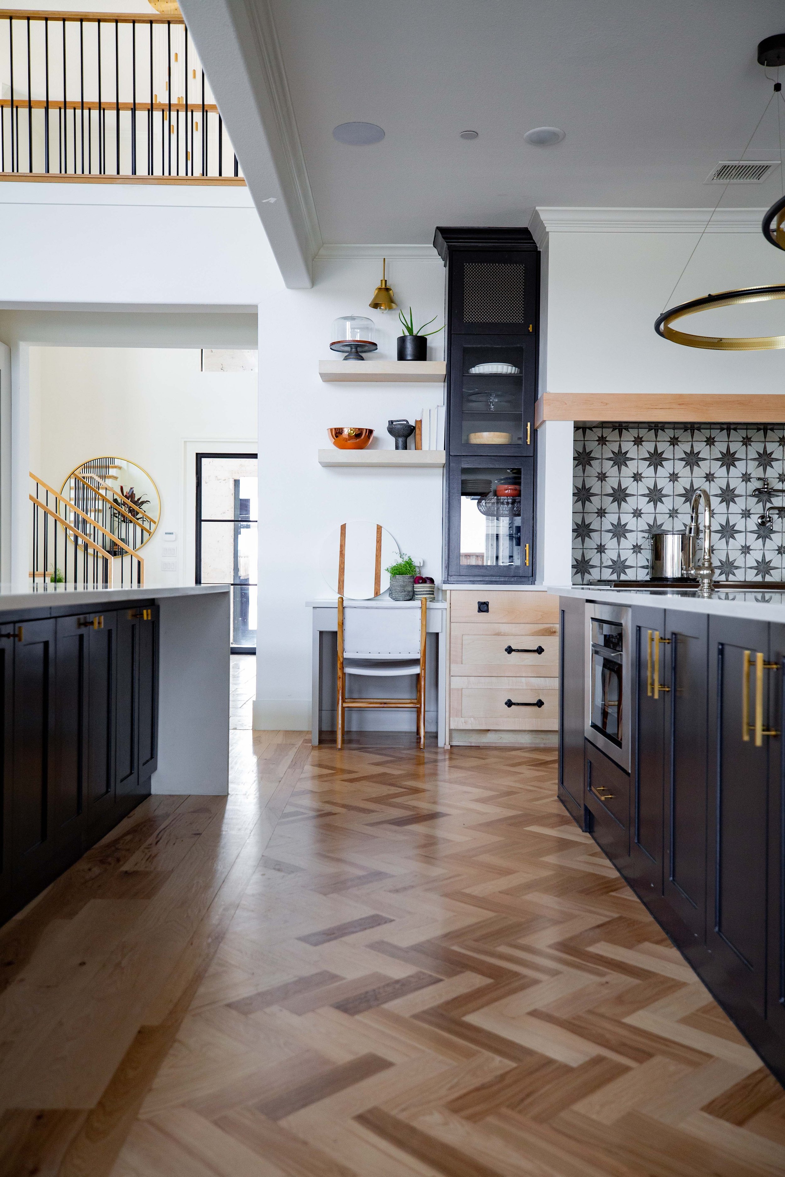
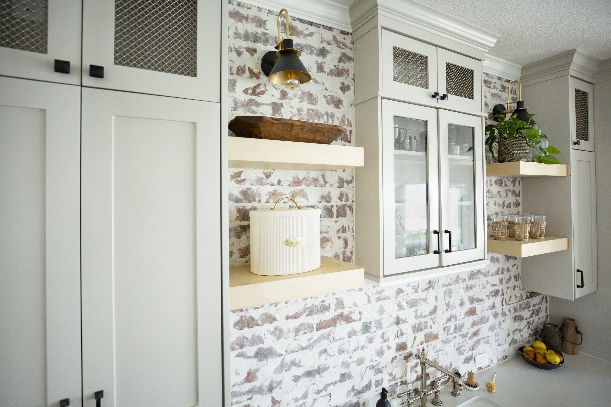
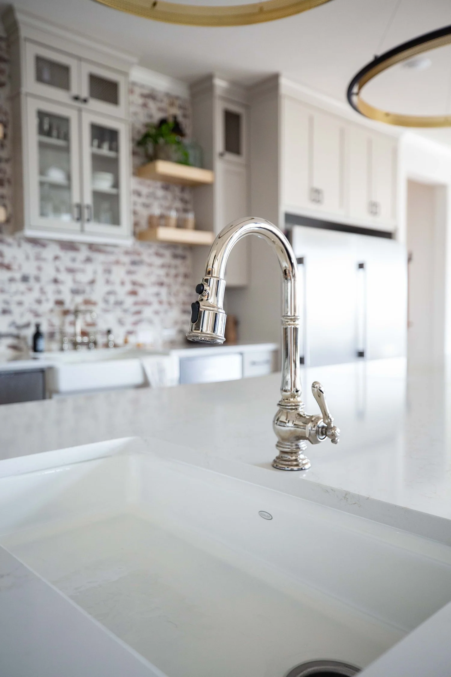
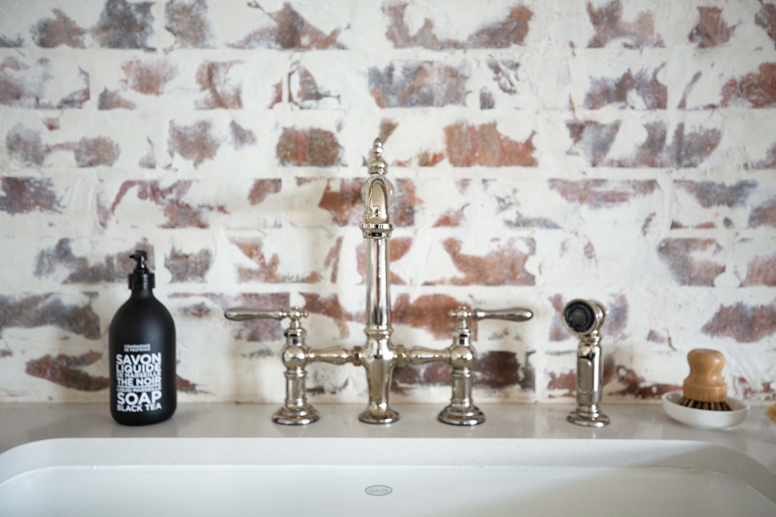
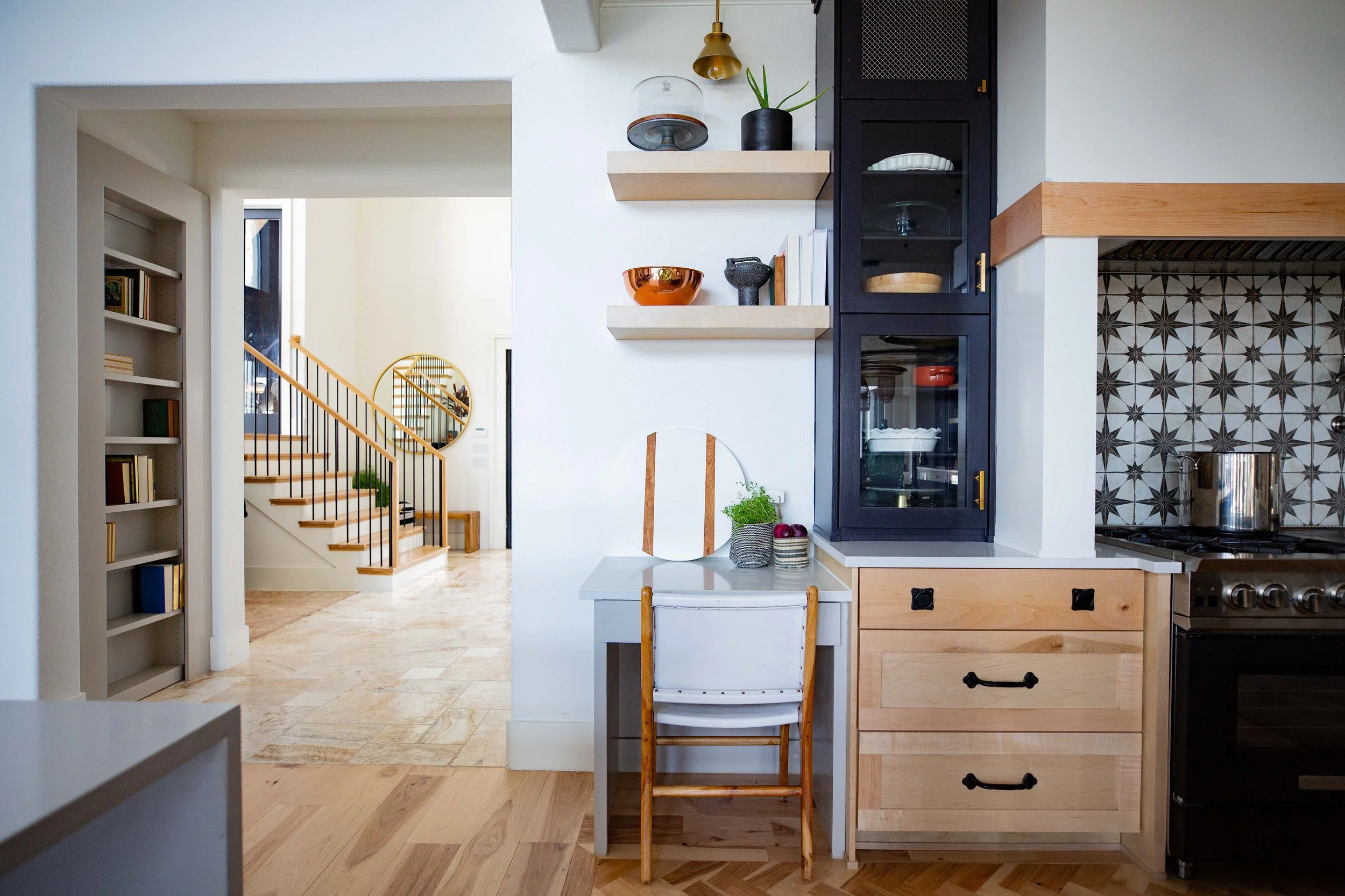
This client is so globally inspired; they love to travel. They also love to have a nice welcoming space for others, so we wanted this to be reflected in the kitchen by adding a lot of different ideas and concepts, but making it all blend together. And we really wanted to make this kitchen a total wow factor. You can see how this was done with the juxtaposition of the tile and the lighting. The lighting is very ultra-modern and chic, but then the backsplash is this really cool aged brick with a lime wash German Schmear type of factor that really makes a great juxtaposition.
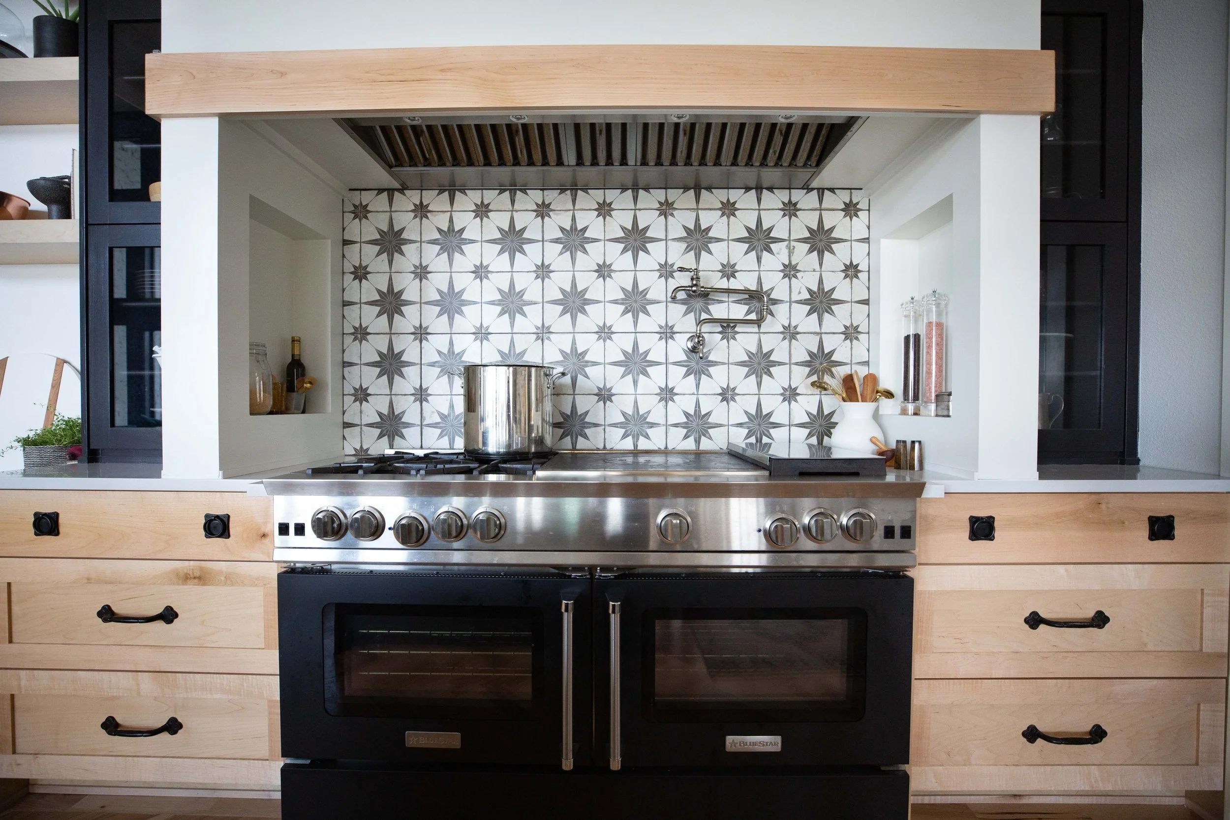
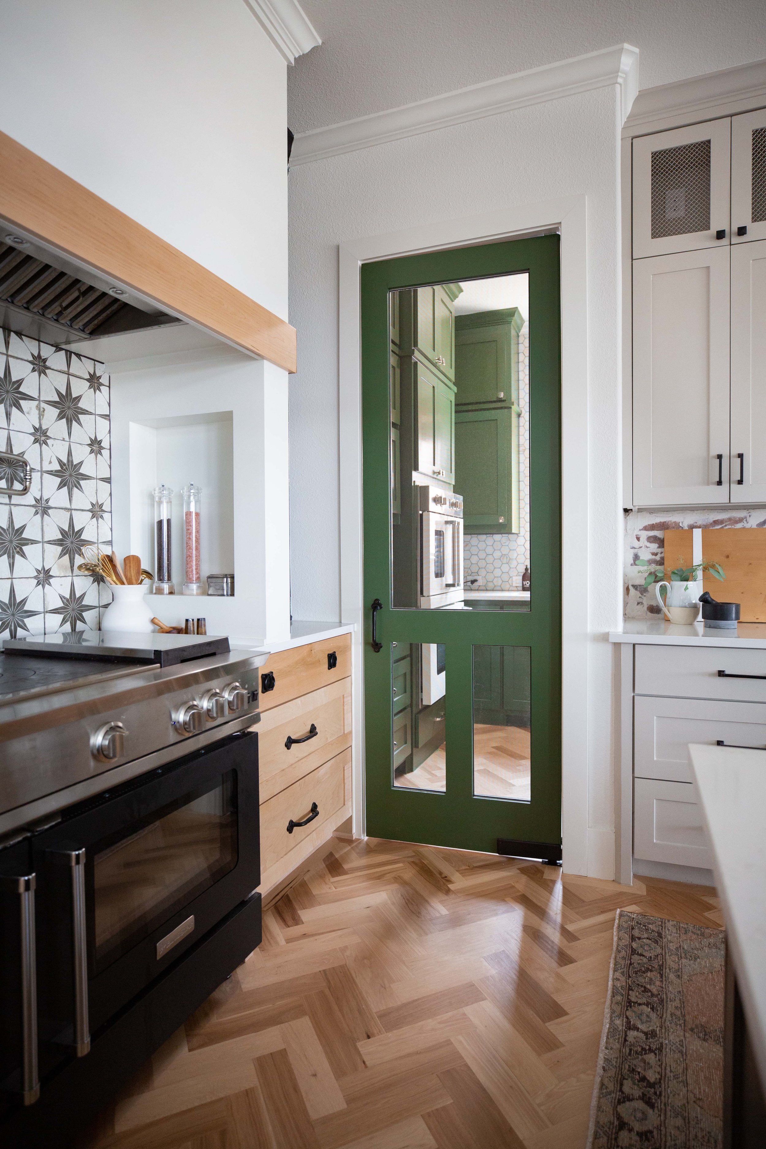
There’s also an amazing moment with the vent hood. It’s a mile long vent hood with this incredible range for this family that loves to cook.
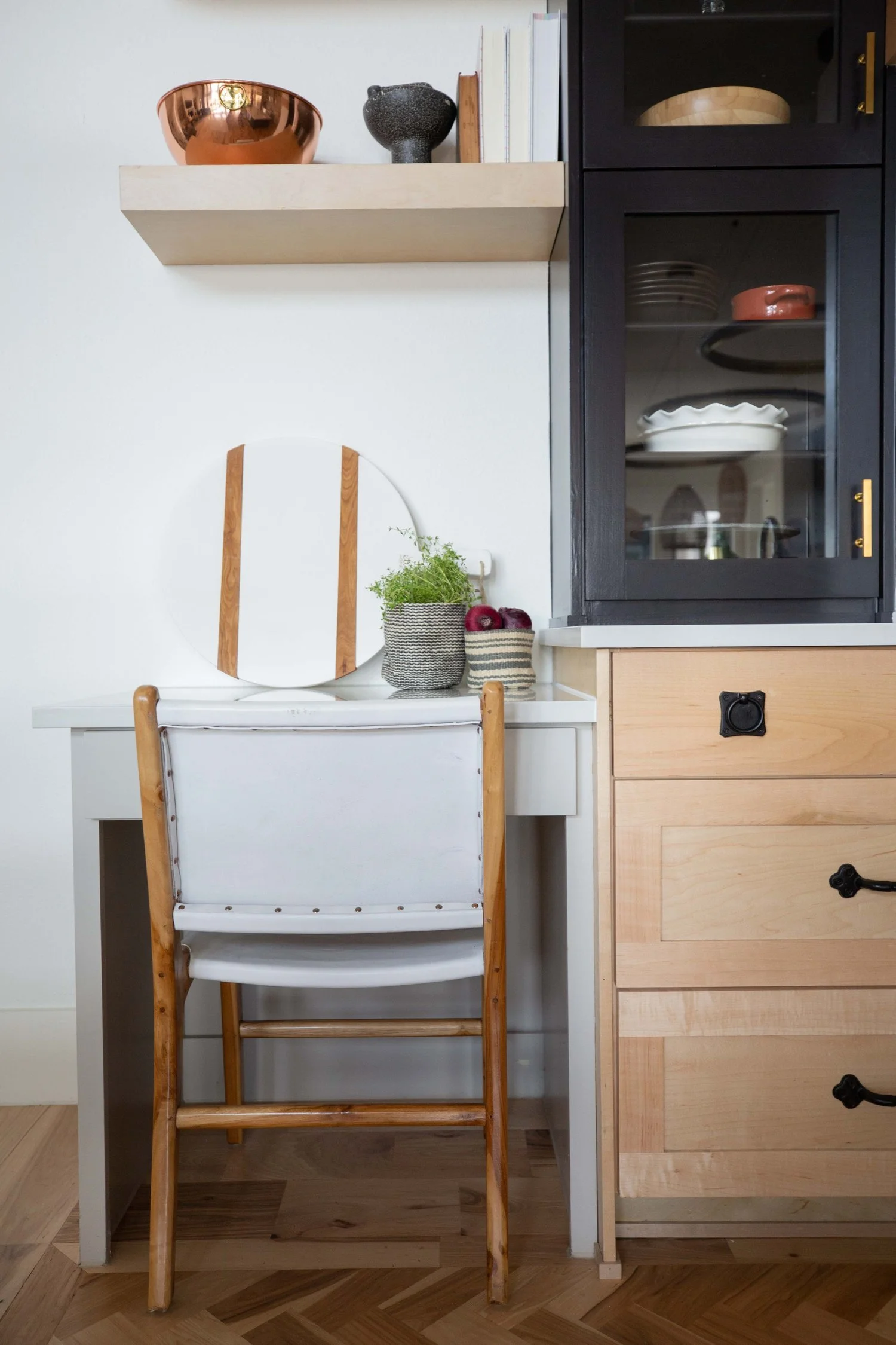
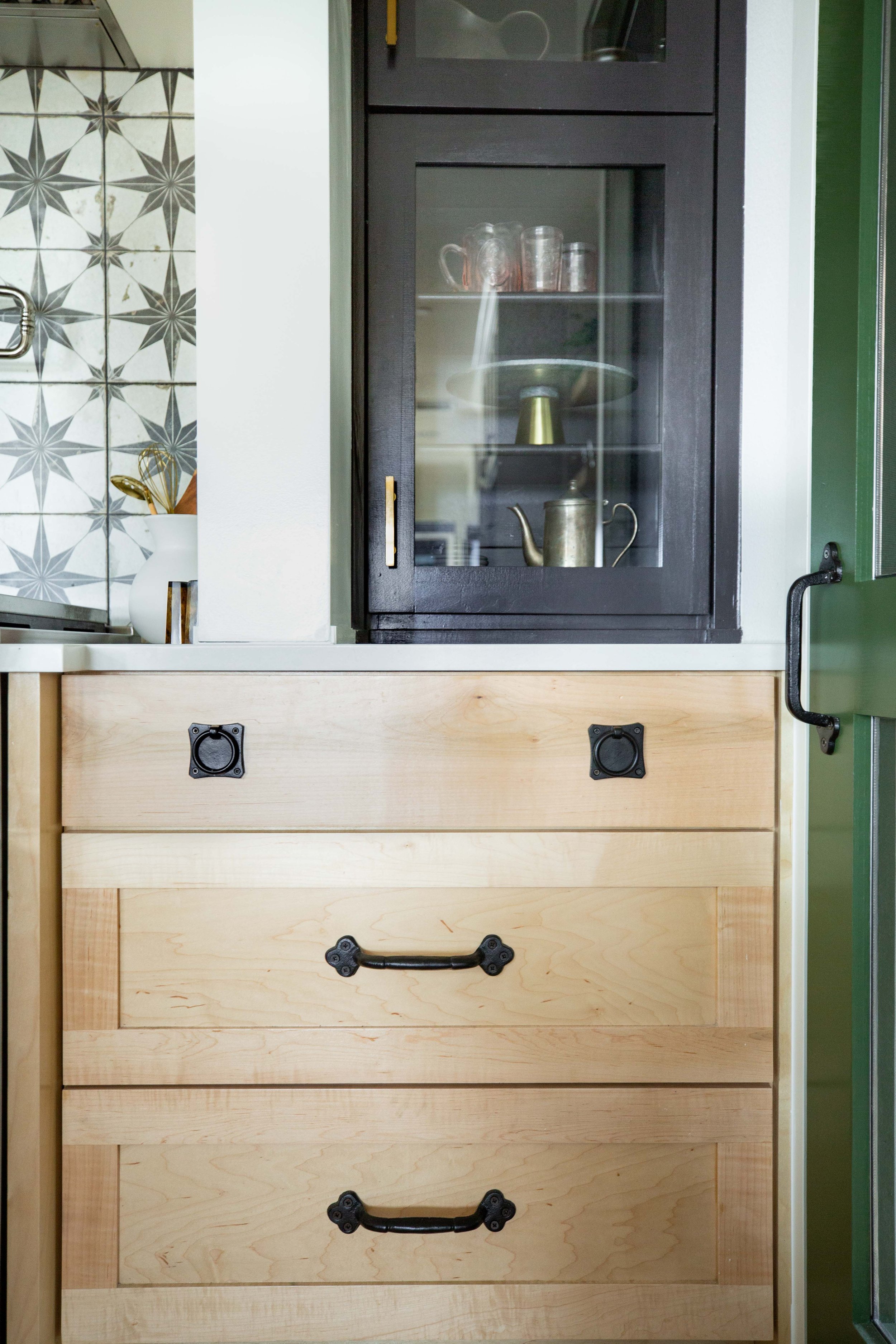
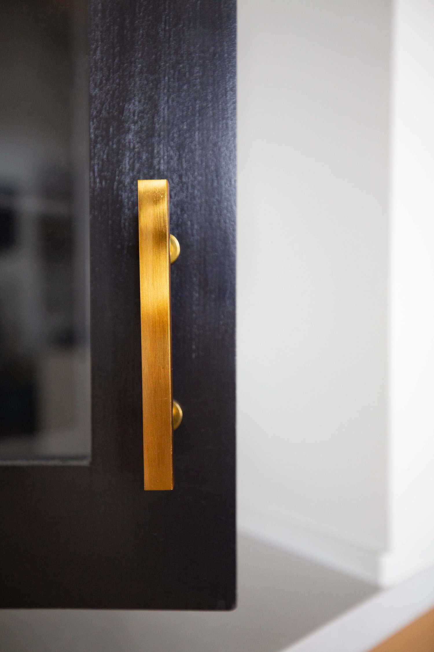
You can definitely see some cool mixed metals in this space, from the brass touches on the lighting to some really cool matte black sconces and hardware. You can also see that three different metals were mixed. You don’t want to mix more than that, otherwise it feels too busy.
We love Kohler for faucet selections and plumbing. Their products are outstanding and we’re so glad that it was installed in this home.
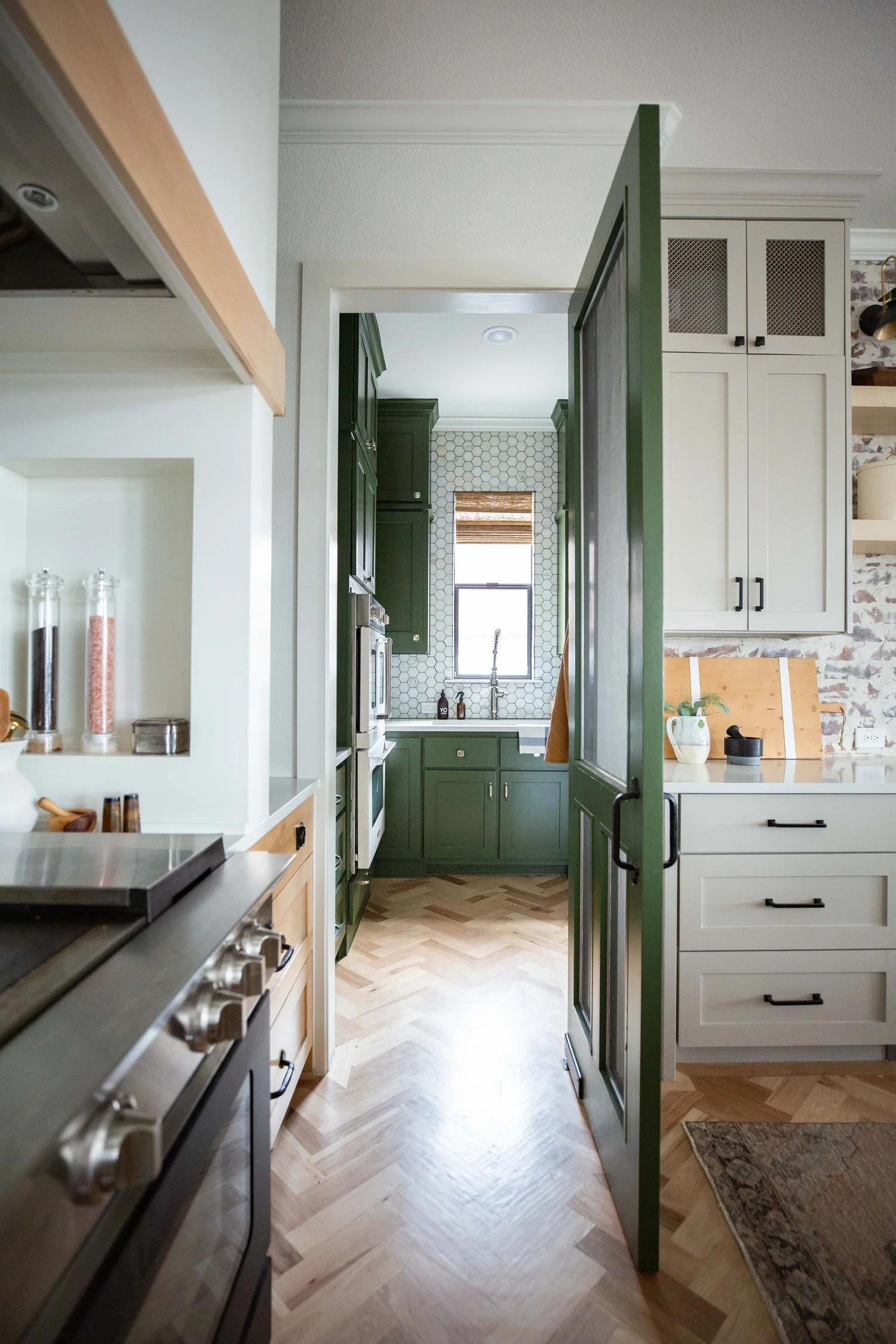
Paint is something that can make or break a home and, in this space full of light, it really had to be just right. Dedicated time was given during construction to come up with different paints that looked awesome. Final decisions on a great neutral white and black were made. Then it got very experimental with color, choosing some really cool greens and even a cool clay potter color that was awesome for this space. It’s so fun to see how it all came together.
We hope you love this globally inspired kitchen as much as we do! Stay tuned next week when we bring you into the dining room. Make sure you’re following along on Instagram to see more of our projects!
All photos by Alison Woomer Photography.

