Favorite Blue Paint Colors at House Sprucing
Choosing the perfect blue paint can transform your home into a serene sanctuary, a vibrant haven, or a sophisticated retreat. At House Sprucing, we’ve rounded up our favorite blue shades to help you find the one that’s just right for your space. Whether you’re looking for light and airy, rich and moody, or something perfectly in between, we’ve got you covered. Let’s dive in!
Light Blues
Light blue tones are perfect for creating a calming and refreshing vibe. These shades work beautifully in bedrooms, bathrooms, or anywhere you want a touch of serenity.
Sherwin-Williams’ "Dew Drop"
A soft, ethereal blue with subtle green undertones, Dew Drop evokes a sense of lightness and calm, ideal for creating a peaceful ambiance.
Sherwin-Williams’ "Sleepy Blue"
This muted blue has a hint of gray, making it a versatile choice for a cozy yet sophisticated look in any space.
Medium Blues
Medium blues strike a balance between cheerful and grounded. They’re versatile enough to use in living rooms, kitchens, and even on cabinetry for a bold yet inviting look.
Sherwin-Williams’ "Grays Harbor"
A perfectly balanced blue-gray that’s both grounding and versatile. It’s an excellent choice for spaces needing depth without overwhelming the room.
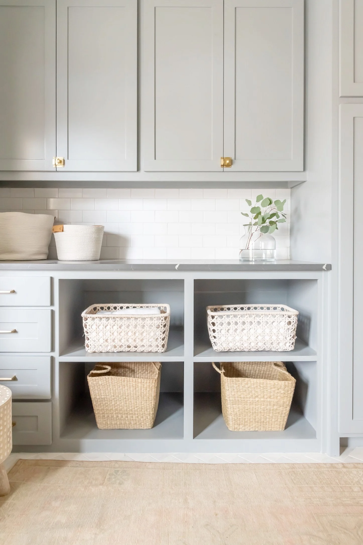
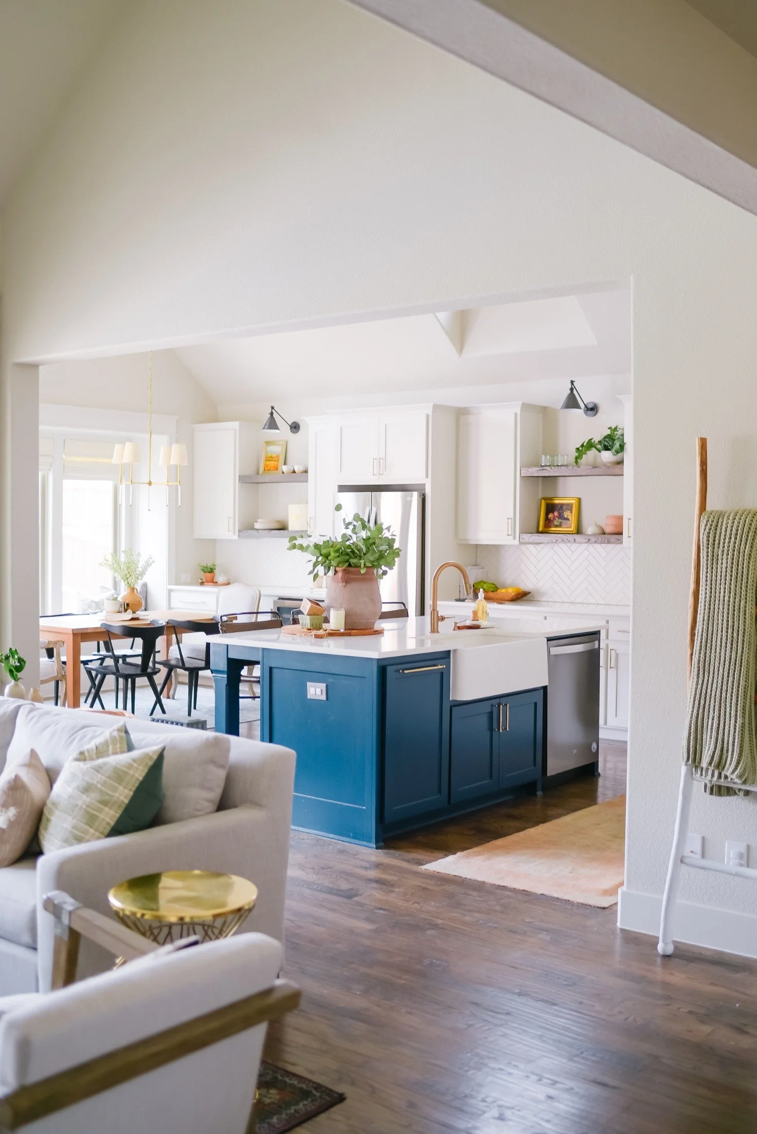
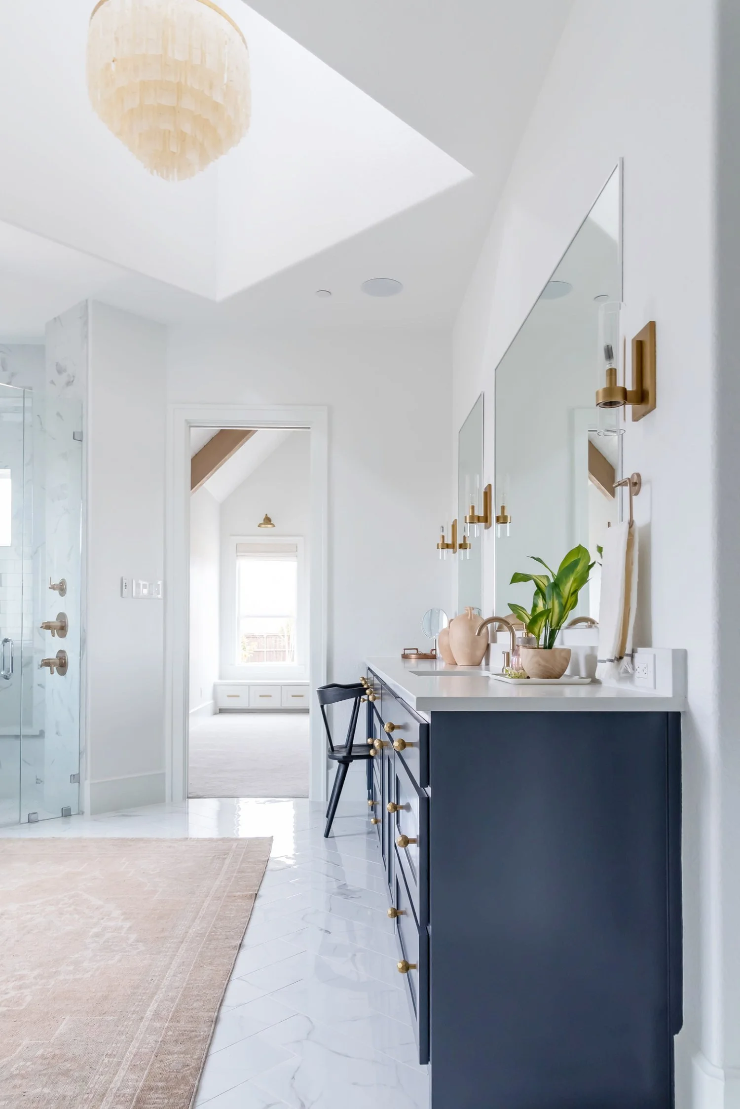
Sherwin-Williams’ "Slate Tile"
A rich medium blue with a touch of sophistication, Slate Tile is perfect for cabinets, accent walls, or any area where you want to make a subtle statement.
Dark Blues
Dark blue shades bring depth and drama to a space. They’re perfect for creating a cozy vibe in dining rooms, offices, or statement walls.
Farrow & Ball’s "Hague Blue"
A deep, inky blue with green undertones, this shade feels luxurious and works well in both modern and traditional designs.
Benjamin Moore’s "French Beret"
A sophisticated dark blue with hints of gray, French Beret adds elegance and depth to any room, especially when paired with warm metals or crisp whites.
Tips for Choosing Your Perfect Blue
Consider Lighting: Blues can shift dramatically depending on natural and artificial light. Always test a swatch on your wall and observe it at different times of the day.
Pair Wisely: Blues pair beautifully with neutral tones like white, gray, and beige. Don’t be afraid to add metallic accents or warm wood tones for balance.
Think About Mood: Light blues are calming, medium blues are uplifting, and dark blues are grounding. Choose based on the atmosphere you want to create.
Ready to refresh your space with a stunning shade of blue? At House Sprucing, we’re here to help you every step of the way—from color selection to final touches. Let’s make your dream home a reality - email us at hello@hsdesignteam.com or text us at 214-471-0917.